
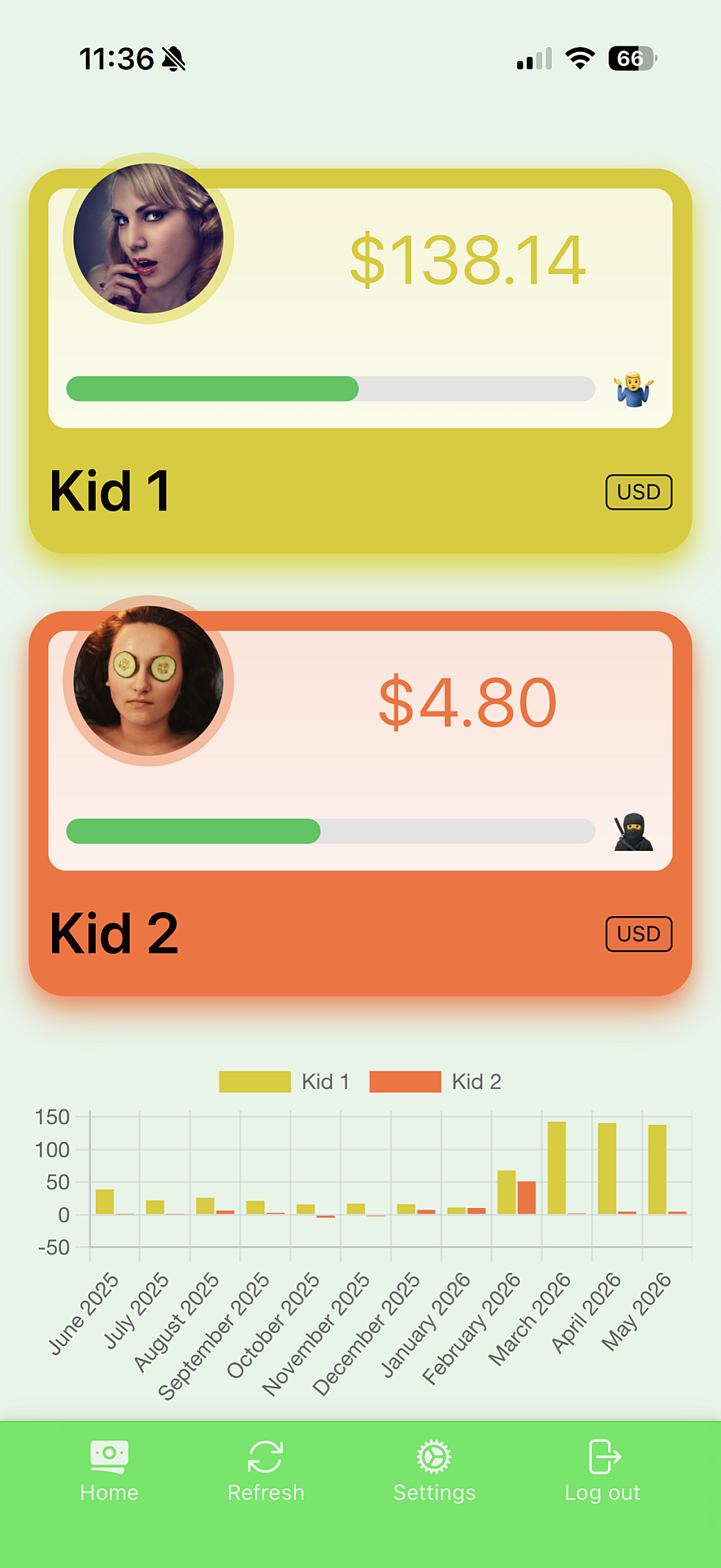
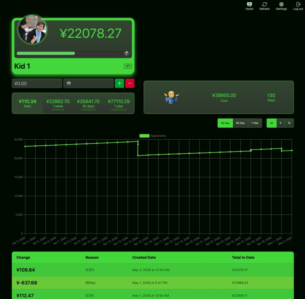
My family and I are at the store and we’re walking by the toy isle. I see my older kid eying a Rubik’s Cube and he asks me, ”how much money do I have?“. I pull up my phone, tap the icon on the home screen, and reply ”it looks like you’re up to $134 right now.“
”Can I get this Rubik’s Cube?“
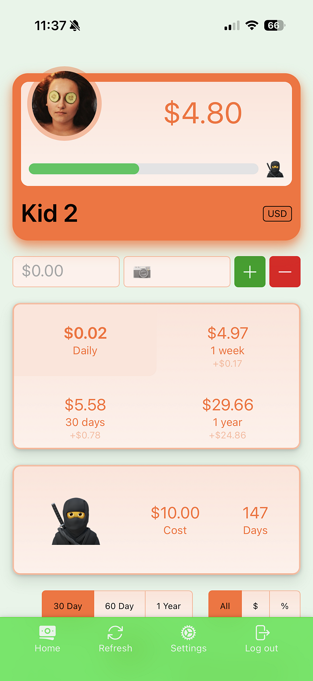
”Sure.“ I deduct $8.99 and show him the screen to show him his new balance. Then I lean over to the other kid who’s been in the red for about a week, ”Hey, it looks like you gave me another 2¢ yesterday.“, and show him the screen with a total of -$4.25 under his name. Below that it shows that $0.02 was deducted over night.
His eyes roll as he looks around and thinks about his next purchase.
Kids Money, the money-tracking app I put together in 2022 has been working really well for us. My kids can now see that earning interest can compound and that the more you save, the more you get—for free.
The Nuxt.js-powered app has been working fine with just a few minor updates and dependency bumps over the past few years. It’s never gone down and I’ve never lost data from its SQLite database.
I wanted to update all of the dependencies to their latest versions and add a few features to the app, but looking at the source code got me re-thinking things a little bit. I wrote the original app using Tailwind UI, so refactoring that would mean needing to re-learn Tailwind’s class names. While there was nothing wrong with the Nuxt setup, I got this itch to see if I could take the scope of this app and re-make it using tools closer to the web platform—namely web components.
Dropping Nuxt would require stripping things back down and re-building parts of the app’s server that Nuxt made a breeze to set up before. But I’ve been exposed to a lot of server-related TypeScript recently, and this would give me an opportunity to learn a little bit more about what I consider back-end work.
Refactoring the Foundation
So since AI is the big thing these days, I wrote a prompt and told Claude to refactor the app using web components and vanilla CSS. It did just that and I didn’t learn anything, so I’ll see you in the next blog post! Byeee...
Okay, just kidding.
I actually did use Google’s Gemini and PhpStorm’s Junie to help with this app, but for the most part Gemini search results replaced Stack Overflow for programming Q&A, and Junie helped me pick the server technology and it made my JSDoc comments more robust. Outside of that, I felt like it would have taken me longer to come up with and write prompts than it would have been to write this myself.
If this were a bigger project, it might be worth investing the time—and money—into setting up some agents and letting them go to town on the source code, but I honestly didn’t think there was a benefit to it here.
A New Server
The back-end is what drives a lot of the important functionality in this app. I previously picked SQLite for data storage and I had set up Prisma to handle defining its schema. This was still working great, so I decided to keep all of that in place.
However, Nuxt’s server setup is what managed the API, using different files to define different endpoints. Since Nuxt was getting removed, I wound up setting up Express and TypeScript to run the new server directly on Node. I learned that starting in version 22, Node would now ignore TypeScript’s syntax, so I didn’t need to set up a bundler, like Webpack or Vite, to compile the server together.
Nuxt 3 did make setting up server API really easy to do, but because I didn’t go too far into writing Nuxt or Vue-specific code on the server end, porting the endpoint files over to Express callbacks was actually very straightforward. To the point where I was impressed at how easy Express was to get up and running and how painless the process seemed.
I did really appreciate how much pain Vite protects you from on the TypeScript configuration side of things. Most of my previous types came over without change, but I did have to learn how to configure TypeScript for Node instead of browser-based code. It’s not all that different, but I decided to move the whole server side of things to it’s own directory so I could keep it’s package.json and tsconfig.json files separate from the front-end code.
Where I landed was that any code that is shared between the front-end and the server lived in the ./server directory so I can keep everything that was important to the Node server contained in one place. Because the front-end is compiled, and Vite makes grabbing things from parent directories easier, I set up aliases from the front-end to the server so I can pull in what I needed.
Also, because this setup didn’t have the quality-of-life features you get from Vite, I finally learned why people don’t like TypeScript enums. While I do like using enums, in general, I found it easier to convert them all over to regular JavaScript objects. It makes Node happy and it didn’t change how I use the objects all that much.
// This enum ...

export enum Currency {
  Euro= 'EUR',
  JapaneseYen = 'JPY',
  MalaysianRinggit = 'MYR',
  SingaporeDollar = 'SGD',
  UnitedStatesDollar = 'USD',
}

// ... becomes this const ...

export const Currency = {
  CanadianDollar: 'CAD',
  Euro: 'EUR',
  JapaneseYen: 'JPY',
  MalaysianRinggit: 'MYR',
  SingaporeDollar: 'SGD',
  UnitedStatesDollar: 'USD',
} as const

// ... and this type (for convenience)
export type CurrencyValue = typeof Currency[keyof typeof Currency];
Server Hosting
The real server-related pain—and learning—came from the process of hosting the app on my personal VPS server. I had a front-end UI that needed to be hosted on a static hosting location that is accessible via the browser, and I had a server that needed to be running in the background. In my head, this meant I had to have two different sites set up on my VPS.
I kept the front-end where it currently lived, and I created a new subdomain for the back-end server. I use Laravel Forge to provision sites on my server, so I created a new site there and pointed the subdomain to it.
APIs across domains means one thing: CORS.
While I’ve dealt with CORS before, using Express and layering that on top of NGINX meant I had two places where CORS comes into play. First, an API request will hit NGINX, so you need to allow requests from the origin server to come through, while making sure API requests from any other location were blocked. Then when request made it through NGINX and get routed to the port your server is listening, you have to handle CORS on the JavaScript side of things.
It took me some time to figure this out and I’m glad I struggled through it. I have a better understanding on how to debug this on both layers. A lot of it came down to getting NGINX set up correctly and making sure the right headers are getting passed through only once, after Express does its thing.
The day after I had this working, I realized what the Nuxt server was doing and I wound up moving all of my server requests to a URI prepended as /api/<endpoint>, then I moved my whole server setup back under the original domain’s server. NGINX now proxies API requests to the port that the server is running on, and I can keep everything hosted on the one domain.
The way the app and the server work, it’s still possible to split things off onto their own servers again and update the .env files to direct that, so I like that I have this choice if I need to move things around in the future.
De-Frameworking the Front-End
My goal for the design was to keep things the way they were, for the most part, but since I wasn’t using Tailwind anymore, I would need to either strip out a bunch of classes or rewrite the HTML and CSS from scratch. I figured it was easier to start from scratch since I remember using Tailwind often led to more nested <div> elements to get the right amount of containers in place to achieve certain layouts.
I was also dropping Nuxt, so basic things that Nuxt handled for you needed to be re-thought through. For example, I knew I would have a few pages and I would need to handle routing. Also, losing Vue’s composables and Nuxt’s state management meant that I’d have to figure out how to pass data around to different components.
I was planning on using Lit to make building out the web components easier, and so I decided to give their signals feature a try. It’s based on the TC39 proposal for signals, so hopefully when signals are baseline, the process to moving to native signals will be pretty easy to do.
Signals in Lit are basically global variables that can be set and get as needed. When a signal changes, or is read within a lit-html template, the component will re-render. Here’s an example around how I used a signal to track the currency used to display money values.
import { signal, Signal } from '@lit-labs/signals'
import { Currency } from '@/constants/currencies.ts'
import { CurrencyValue, RouteValue } from '@types'

/* The currency selected by the user. This converts money values and displays them in the selected currency. */
export const selectedCurrency: Signal.State<CurrencyValue> = signal(Currency.UnitedStatesDollar)
I set up the signal and provide it with a default value. Then in any component where I want the template to get updated, I change the component from extending LitElement over to extending SignalWatcher(LitElement):
import { html, LitElement } from 'lit'
import { selectedCurrency } from '@/signals.ts'
import { SignalWatcher } from '@lit-labs/signals'
import { currencyDetails } from '@/constants/currencies.ts'
import { LocalStorageItems } from '@/constants/local-storage.ts'
import { CurrencyValue } from '@types'

/**
 * Pops up a select field that changes the currency used to display money values around the app.
 */
export class CurrencySelector extends SignalWatcher(LitElement) {
  /**
   * =========================================================================
   * METHODS
   * =========================================================================
   */
  /**
   * Updates the global state and stores the selected value into local storage.
   */
  private async _onCurrencyInput(e: Event) {
    const currency = (e.target as HTMLSelectElement)?.value as CurrencyValue
    selectedCurrency.set(currency)
    localStorage.setItem(LocalStorageItems.SelectedCurrency, currency)
  }

  /**
   * =========================================================================
   * LIFECYCLE
   * =========================================================================
   */
  protected render() {
    return html`
      <setting-chip>
        <span slot="label">${selectedCurrency.get()}</span>

        <form-input>
          <label for="currency">Change Currency</label>
          <select id="currency" @input="${this._onCurrencyInput}">
            ${Object.entries(currencyDetails).map(([key, value]) => {
              return html`<option value="${key}" ?selected="${key === selectedCurrency.get()}">
                <strong>${value.symbol}</strong>${value.title}
              </option>`
            })}
          </select>
        </form-input>
      </setting-chip>
    `
  }
}

declare global {
  interface HTMLElementTagNameMap {
    'currency-selector': CurrencySelector
  }
}
selectedCurrency.get() gets the current value, then selectedCurrency.set() updates the signal and populates all places where the signal is used.
Anchors Away
I know a lot of work went into making CSS anchor positioning a thing, and I’m so glad it’s here. Yes, tooltips and popovers were possible before anchor positioning, but instead of messing with z-index levels and doing the logic to figure out if the popover should be above or below the thing it should stick to, putting together a really quick popover menu can be done in a few lines of CSS.
I wound up making a little component that I used as a wrapper around <label> and <input> elements. When a button in the component is clicked, a popover displays the label and field inside. I used the popover toggle event to take actions upon closing the popover.
import { css, html, LitElement, nothing } from 'lit'
import { SignalWatcher } from '@lit-labs/signals'
import { property } from 'lit/decorators.js'
import { classMap } from 'lit/directives/class-map.js'

/**
 * Provides a popover that appears when the slotted label is clicked. An event is fired when the popover closes, so an action can take place.
 */
export class SettingChip extends SignalWatcher(LitElement) {
  /**
   * =========================================================================
   * CSS
   * =========================================================================
   */
  static styles = css`
    .display {
      anchor-name: --display;
      appearance: none;
      background-color: transparent;
      border: none;
      transition: opacity var(--duration-hover) ease-out;
      cursor: pointer;

      &:not(.unstyled) {
        display: inline-block;
        padding: 5px;
        background-color: color-mix(
          var(--component-setting-chip-color, var(--kid-color-text-on-favorite, currentColor)) 3%,
          transparent
        );
        border: 1px solid var(--component-setting-chip-color, var(--kid-color-text-on-favorite, currentColor));
        border-radius: 4px;
        font-size: var(--font-size-xs);
        text-box: trim-both cap alphabetic;
        color: var(--component-setting-chip-color, var(--kid-color-text-on-favorite, currentColor));
      }
      &:hover {
        opacity: 0.5;
      }
    }
    [popover] {
      position-anchor: --display;
      position: fixed;
      position-area: block-end;
      position-try-fallbacks: block-start;
      margin: 3px;
      padding: 18px;
      max-width: 300px;
      background-color: color-mix(var(--kid-color-bg-light, var(--component-setting-chip-popover-bg)) 70%, transparent);
      border: 1px solid var(--kid-color-favorite, var(--component-setting-chip-popover-color));
      border-radius: var(--border-radius-md);
      box-shadow: var(--kid-box-shadow-element, var(--box-shadow-element));
      backdrop-filter: blur(13px);
      color: var(--kid-color-text-on-bg-light, contrast-color(var(--component-setting-chip-popover-bg)));
      transition:
        display var(--duration-overlay) ease-out allow-discrete,
        overlay var(--duration-overlay) ease-out allow-discrete,
        opacity var(--duration-overlay) ease-out;

      &::backdrop {
        backdrop-filter: saturate(90%) brightness(70%);
        opacity: 0;
        transition:
          display var(--duration-overlay) ease-out allow-discrete,
          overlay var(--duration-overlay) ease-out allow-discrete,
          opacity var(--duration-overlay) ease-out;
      }
      &:popover-open::backdrop {
        opacity: 1;

        @starting-style {
          opacity: 0;
        }
      }
    }
  `

  /**
   * =========================================================================
   * PROPS
   * =========================================================================
   */
  /**
   * Disabled the popover. The label is still displayed on the page.
   */
  @property({ attribute: 'data-disabled', type: Boolean })
  disabled = false

  /**
   * Disables the default styles around the label.
   */
  @property({ attribute: 'data-unstyled', type: Boolean })
  unstyled = false

  /**
   * =========================================================================
   * LIFECYCLE
   * =========================================================================
   */
  protected render() {
    const buttonClasses = {
      display: true,
      unstyled: this.unstyled,
    }

    if (this.disabled) {
      return html`<slot name="label"></slot>`
    }

    return html`
      <button class="${classMap(buttonClasses)}" popovertarget="settings"><slot name="label"></slot></button>
      <div
        id="settings"
        popover
        part="popover"
        @toggle="${(e: ToggleEvent) =>
          e.newState === 'closed' && !this.disabled ? this.dispatchEvent(new SettingChipClosedEvent()) : nothing}"
      >
        <slot></slot>
      </div>
    `
  }
}

export class SettingChipClosedEvent extends Event {
  static readonly eventName = 'closed'

  constructor() {
    super(SettingChipClosedEvent.eventName, { bubbles: true, composed: true })
  }
}

declare global {
  interface HTMLElementTagNameMap {
    'setting-chip': SettingChip
  }
}
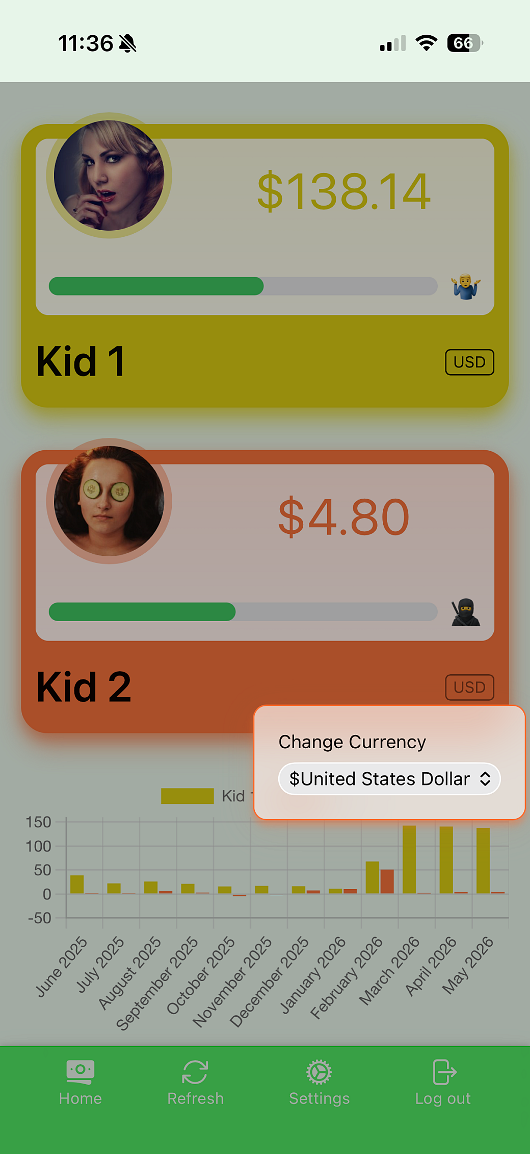
For example, I put together a currency selector:
It’s super simple and it takes care of positioning itself above or below the activator element. I had some fun ideas to crank up the backdrop-filter effects on the backdrop, but I found that doing a simple backdrop-filter: saturate(90%) brightness(70%); does a good job at highlighting the popover content. I tested both approaches on a mobile device and honestly, the simpler effect looked better.
What I like most about this kind of popover menu is that it helped me clean up some of the UI for functionality around the app. In addition to the currency selector, I wound up using this menu popover all over the Settings page.
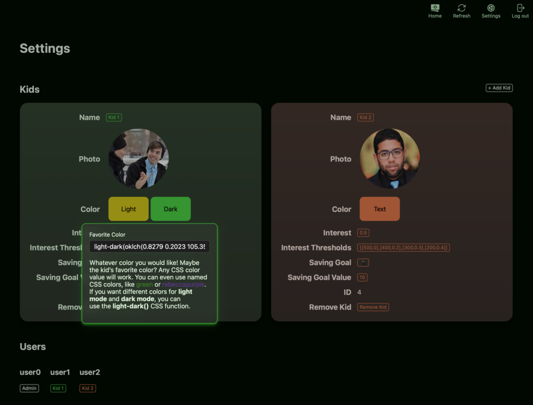
Customizable Colors
In the first version of the app, I let my kids pick a color they wanted to use to represent themselves. Their favorite color at the time, or just whatever they thought looked cool. In that version of the app, I used things like opacity to work with their selected color in different ways and I basically defaulted to using white on top of their color for some areas of text. There were some limitations there because if a color were too light we’d have legibility issues. While the app supported dark mode, readability got even more complicated on a darker background.
Time helped improve things for the 2.0 version, because in the years since 2022, browsers have started implementing three color-related functions:
- The
light-dark()function lets you set one color value for light mode, and another color for dark mode—based on the user’s preferences in their OS or their browser. - Using
color-mix()lets you combine a color with another one. So something likecolor-mix(red 25%, white)would become an almost pink-ish shade of red. contrast-color()takes a color value that you pass into it and determines if a better contrast to it iswhiteorblack. You can then throw thewhiteorblackvalue you get fromcontrast-color()intocolor-mix()to blend it with your original color value.
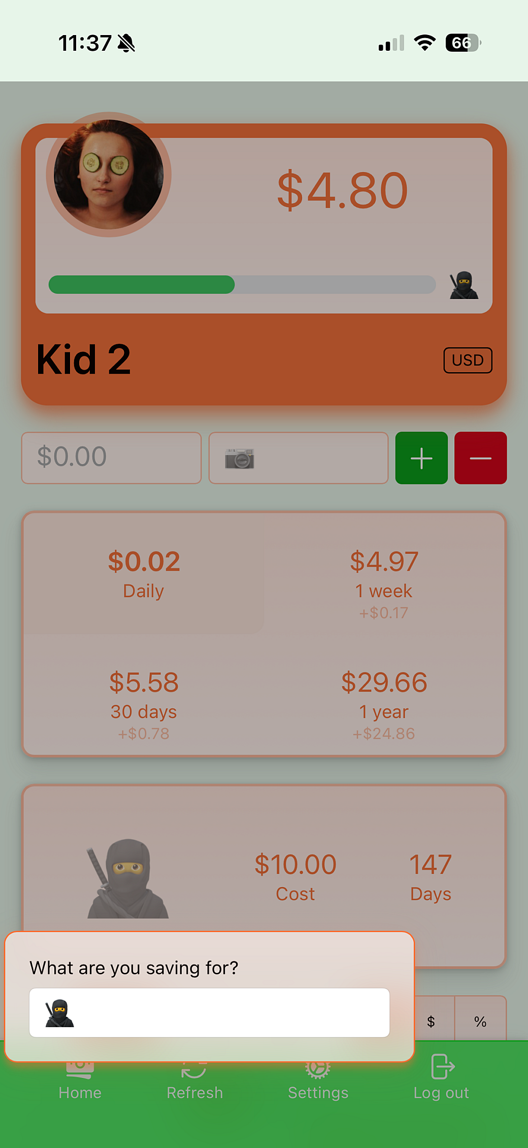
While the last version of the app let the kids use a browser color picker, I opted to make it a text field and moved the color setting into the Settings page—which is only accessible by an admin account. I did this because I wanted the kids to get to use extended color spaces, like oklch, which I don’t think is built into the current browser color picker. Also, this text field allows the kids to use the light-dark() function—allowing them to have one color in light mode and another in dark mode.
To show the kids what the color will look like, I added small boxes to show the colors they added, and then used contrast-color() to show if that color will select white or black text on top of it.

This all works great in that wherever a kid is shown in the app, I set a CSS Custom Property, --color-favorite, to their color in an inline style attribute on the main container. From there, color-mix() is heavily used for backgrounds, border colors, and some text. Then it uses contrast-color(var(--color-favorite)) to figure out if text on top of the color should be based on white or black.
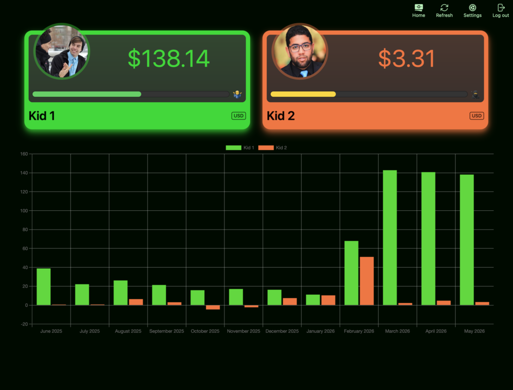
However, this gets a little tricky in one area of the app. The graphs on the homepage and on the kid’s individual pages are powered by Chart.js, which renders the charts onto <canvas> elements. I think I understand that there’s an issue here in that when rendered to a canvas, the CSS color functions aren’t processed in the same way CSS properties are in normal DOM elements. So light-dark() or color-mix() won’t work and I don’t think CSS Custom Properties make it in either.
Or it could just be Chart.js and how it works with color. Currently they recommend sticking with rgb() and rgba() CSS color formats.
That’s totally fine. Since I’m way down the JavaScript hole, I set up a way to convert the colors to rgb() when the color settings are retrieved from the API:
/**
 * Returns the light and dark colors that are parsed from a CSS color value.
 *
 * @param {string} color A CSS color value. Can contain CSS functions, such as `color-mix()` and `light-dark()`.
 * @return {KidColors} An object containing the light and dark versions of the color.
 */
export function getLightDarkColorsFromColor(color: string): KidColors {
  let light = color
  let dark = color

  // Create temporary element
  const spanElement = document.createElement('span')
  spanElement.style.color = color
  spanElement.style.colorScheme = 'light'

  // Add element to DOM
  document.body.appendChild(spanElement)

  // Get computed color for light mode
  const lightStyle = getComputedStyle(spanElement)
  light = lightStyle.getPropertyValue('color').trim() ?? color

  // Change color scheme to dark
  spanElement.style.colorScheme = 'dark'

  // Get computed color for dark mode
  const darkStyle = getComputedStyle(spanElement)
  dark = darkStyle.getPropertyValue('color').trim() ?? color

  // Remove temporary element
  document.body.removeChild(spanElement)

  return { light, dark }
}
To explain the code above, I have a new <span> element created and I set the color CSS property to the color value for one of the kids. This can be a single rgb() color, or one that uses color-mix() or light-dark(). At first, I set that <span> to render in light mode, then I place the <span> at the bottom of the page.
From there I can use window.getComputedStyle() to get all of the styles currently set for that <span> element. Most of the styles are browser defaults, but the color property is an rgb() CSS color value.
I save that value as a variable, then I change the color scheme over to dark mode. From there I can get an updated list from getComputedStyle() and it will now give me the dark mode rgb() value. After all of that, I clean things up by deleting the <span> element from the page.
This function returns both the light and dark values so I can access them again later.
This is all happening within the _fetchKidsData() method, so I call that method again when the browser detects that the OS appearance setting has changed between dark and light modes.
window.matchMedia('(prefers-color-scheme: dark)').addEventListener('change', () => {
    log('Refreshing data due to color scheme change')
    this._fetchKidsData()
})

Would I build an app like this for public consumption? Its design is scrappy and it’s all fit to my exact needs, but the whole web component and Express server setup is an interesting thing to explore. If it weren’t for the static server setup, this could also have easily been done in PHP (maybe Laravel) or something like Ruby on Rails.
Also, if I were to make this a real app, I probably would abstract things more and there would certainly be testing set up and an actual authentication process built in. But for an audience of 4, this app serves me and my family well.
The lifespan of this app is meant to last until the kids grow up and can start to manage money on their own, so I think this will be the last time I make major updates to the app. I have a few more ideas and I’ll keep tabs on how the kids feel about it as they continue to use it. Otherwise, I hope the new foundation, and with continued use, my kids will continue to learn the lessons of keeping a solid savings going.