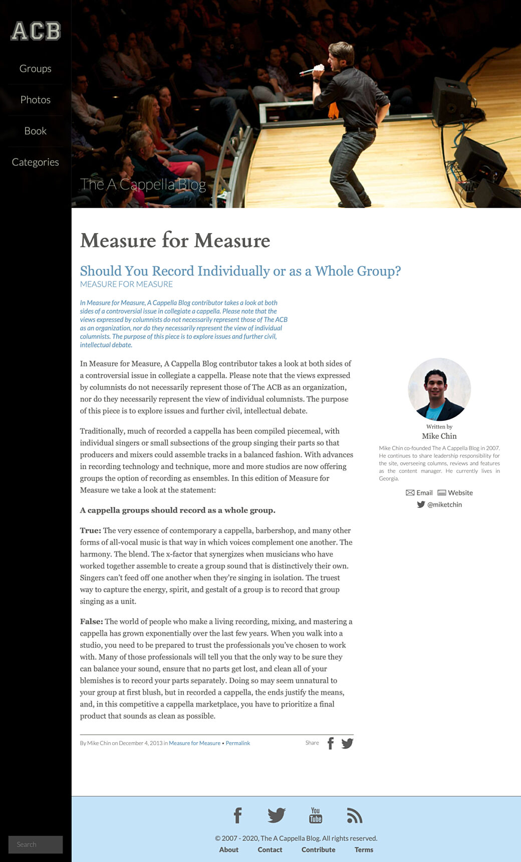
My friends, Mike and Mike, created a website in 2007 revolving around the world of collegiate a cappella. Over years of posting advice, event reviews, and sharing community YouTube videos, the site had accumulated about 1,800 articles over its 12 year run. As life events happened the Mikes decided to say farewell to the blog, but as a service to their passionate, niche audience they decided to keep the site up and running so it can be used as a resource for people just getting started in the a cappella world.
My role in the site started off as the friend who traveled around the country with the crew, occasionally taking photos for events we covered, to taking over design and development of the site so the Mikes could focus on creating content and organizing events and other initiatives. A few years ago we transitioned the site into a Craft 2 website during our final front-end redesign.
As posting came to an end, and as spammers became the main users for the site’s contact form, we decided that the CMS was no longer needed and a good way to keep the site alive would be to transition the articles on the site into an archive using a static site generator. While there are a lot of options out there, a new setup came along that fit the sites needs in a way that was quick to get up and running.
Enter Nuxt Content
Nuxt Content is an extension to Nuxt.js that allows you to fold file-based content into a Nuxt.js site. It makes it easy to create a blog via Markdown, or to drive content using JSON files (as well as with a couple other file types).
After playing around with the Content module, it seemed like the right plan of action looked like this:
- Pull down the current A Cappella Blog Craft site and update the templates to generate JSON files for each article
- Find a tool to scrape the JSON content into files that would be parsed by Nuxt Content
- Move all file uploads into the Nuxt
staticdirectory - Re-create or tweak the site’s CSS it to match the branding of the current site
- Statically generate the site and upload it to the hosting environment

Setting up the JSON templates
A typical article included a title, a category, the category description, the article body itself, and a byline.
While some articles included a featured image, the masthead of the site usually displayed a random image from a selection of photos shot for the site at various events.
The rest of the page included a main navigation, search box, and a footer that linked to a few secondary pages.
In thinking ahead for SEO purposes, I would need to include content driven by SEOmatic for the main page image and description.
{% spaceless %}

{% if entry.body.type('image').first() ?? false %}
  {% set seoImage = entry.body.type('image').first().file.first() %}
{% else %}
  {% set seoImage = craft.assets.source('headerPhotos').assetEnabled('1').order('RAND()').first() %}
{% endif %}

{% set data = {
  title: entry.title,
  category: craft.request.getSegment(1),
  slug: entry.slug,
  uri: entry.uri,
  description: seomaticMeta.seoDescription,
  image: seoImage.url|replace('http://acb-craft-archiver.test:80', ''),
  postDate: entry.postDate|date('Y-m-d H:i:s'),
  formattedDate: entry.postDate|date('F j, Y'),
  body: include('partials/post', { categorySlug: craft.request.getSegment(1), entry: entry })|replace(siteUrl, '/'),
} %}

{{ data|json_encode|raw }}
{% endspaceless %}
The page template that all posts were pointing to now looked something like this. Here I'm generating an object from the CMS via Twig then encoding it to JSON and printing it onto the page. Since there is no <html> or <body> tag here, the only text on the page will be the valid JSON data.
The value of the body was made up of a string that included all of the rendered HTML for the article using a Twig partial I had already had in place.
In a couple of spots I used a Twig replace filter to change URLs from absolute URLs to relative URLs that worked with my Nuxt router patterns.
With the page template modified, I now had to get the content out of the CMS.
Little Scraper
The next step was to come up with a way to get all of this JSON from each page and save it to files in the new Nuxt content directory.
This was one of those situations where I could have taken the time to research the popular Node-based scrapers or I could have used this as an opportunity to try out something like Deno, but I knew exactly what I needed to do and I knew how to build it.
I threw together a tiny Node module that takes a list of URLs from a JSON file, pulls the rendered JSON templates for each URL, then writes it out to a local .json file.
To get the list of URLs, I went back to my local version of the Craft 2 site and created another template. This time it didn't matter where the template was as I was just dropping in some Twig code to loop through all of the entries on the site and generate the list of source URLs and destination URIs for each entry.
[
  {% set entries = craft.entries.section('article').limit(null) %}{% for entry in entries %}{
    "dest": "posts/{{ entry.uri }}",
    "url": "{{ entry.url }}"
  }{% if not loop.last %},{% endif %}{% endfor %}
]
The resulting code looked something like this:
[
  {
    "dest": "posts/open-letters/farewell-from-the-a-cappella-blog",
    "url": "http://acb-craft-archiver.test:80/open-letters/farewell-from-the-a-cappella-blog"
  },{
    "dest": "posts/tuesday-tubin/icca-champions",
    "url": "http://acb-craft-archiver.test:80/tuesday-tubin/icca-champions"
  },{
    "dest": "posts/recording-recommendations/legalities-and-referrals",
    "url": "http://acb-craft-archiver.test:80/recording-recommendations/legalities-and-referrals"
  },{
    "dest": "posts/tuesday-tubin/house-of-memories-and-safe-and-sound",
    "url": "http://acb-craft-archiver.test:80/tuesday-tubin/house-of-memories-and-safe-and-sound"
  }
]
After a little trial and error I used the scraper to pull the content for all of the URLs and placed the resulting JSON files into the content folder of my Nuxt site.
Nuxt Pages
Pulling the JSON content into my Nuxt page was straightforward from here. I set up a dynamic route to match the /category/slug pattern and passed in the resulting category and slug route parameters into my Nuxt Content lookup.
<template>
  <div v-if="Object.keys(entry).length">
    <HeaderImage acb-logo />
    <div class="md:pl-nav-desktop py-5">
      <div class="px-3">
        <ArticleBody :article-content="entry.body" />
      </div>
    </div>
  </div>
</template>

<script>
import { seoFromArticle } from 'JS/settings.js';
import ArticleBody from 'Components/article_body/ArticleBody.vue';
import HeaderImage from 'Components/header_image/HeaderImage.vue';

export default {
  components: { ArticleBody, HeaderImage },
  async asyncData({ $content, params }) {
    const entry = await $content('posts', { deep: true })
      .where({ uri: `${params.category}/${params.slug}` })
      .fetch();

    return {
      entry: entry[0],
    };
  },
  head() {
    return Object.keys(this.entry).length ? seoFromArticle(this.entry) : {};
  },
};
</script>
For the header image, I created a HeaderImage component that randomly picks a srcset from a collection of images.
I create an ArticleBody component that handles styling the legacy markup wherever it is used. This was also used for the one-off pages, like About and the Book page.
Finally, a helper function is used as a template for my SEO meta data, based on those fields brought in with the single page JSON.
After being rendered by Nuxt.js, an unstyled page looked something like this:
Modern CSS for Old Markup
Styling the site could have been as easy as copying and updating the rendered CSS and including it in my Nuxt site, but the design of this site is so simple that I grabbed the the color palette, custom fonts, and SVGs from the old site and worked them into my Tailwind-based CSS scaffolding. Without making too many configuration changes, I had most of the styles in place within a matter of hours.
I used this as an opportunity to simplify the UI in some places, so things like the main navigation went from a hamburger-based overlay to a horizontal scrolling list on mobile devices.
One of my favorite design features from the site was the categories menu, so I found it very easy to recreate it in Tailwind, along with just a few extra lines from the old CSS.
While it wasn't something I was worried about during the original build of this site, my CSS scaffold has a real easy way to enable dark mode so I applied it here:


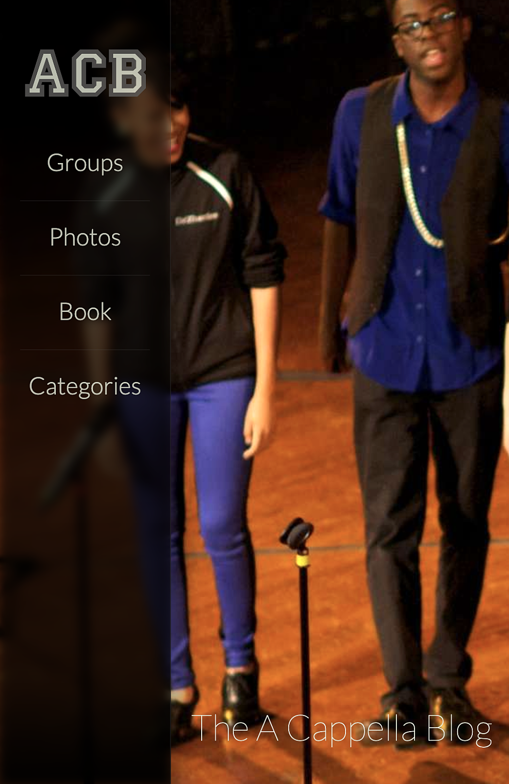
When designing the site back in 2016 filter: blur(); was a relatively new property and I used it for an effect that was meant to make the main navigation sidebar look like it was sand blasted and semi-transparent in front of the header image at the top of the page. To do this back then it looked something like this:
- Load the randomized header image in place, using a focal point field in the CMS to determine the
background-postition(this made it so you could focus on a person’s face as the responsive design cropped the image in different ways). - Load the header image again as a background image in an element behind the main nav and calculate the
background-positionbased on the position of the main navigation and on the height of the viewport and make sure it didn't shrink or get distorted so it matched the header image next to it. - Apply
filter: blur();to the image for the blur effect.
This looked something like this:

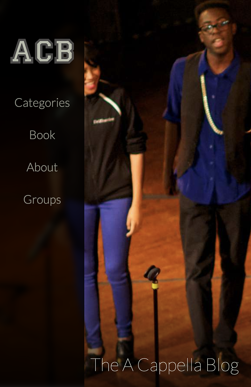
To do this using modern CSS, I simply added backdrop-filter: blur(6px) saturate(150%); to the main navigation sidebar:

When you look closely at the two images, the new way even looks better (in my opinion) in the way that the browser blurs and apply the effect to the elements behind the navigation sidebar. There is no halo effect because filter: blur(); had to be done on the element that contained the background image instead of on the background image itself.
Because I was using Tailwind, I created a set of utilities so I could enable the backdrop-filter using the class, backdrop-blur-6:
function({ addUtilities }) {
  const newUtilities = {};

  for (let i = 0; i < 11; i++) {
    newUtilities[`.backdrop-blur-${i}`] = {
      backdropFilter: `blur(${i}px) saturate(150%)`,
    };
  }

  addUtilities(newUtilities, { variants: ['responsive'] });
Fin
The archive site is now live and can be seen at acappellablog.com. In the future it could be nice to clean up some of the old HTML for errors and to make some changes for better accessibility (something that I wasn’t as attuned to during the original development). Thinking about it, the more I introduce Javascript into my front-end rendering workflow, and the more sites are interactive and dynamic, the harder it may become to simple scrape a site’s HTML and do what I've done here.
At least it’s a good reminder to keep simplicity and well-crafted markup in mind as I’m working on new projects.
