Guide 1 was built to replace your inkjet-printed CMS manual with Twig templates displayed in Craft CMS’s Control Panel (CP). Guide 2 let you edit guides in a code editor and place them in Dashboard widgets and on edit pages. Guide 3 sets out to help you help your content authors by making it easy to put useful information anywhere throughout the CP. Anywhere.
Guide has been rebuilt to be less about that single place to get your CMS manual content (although the main Guide CP section is still there). Guide 3 lets you log in, create a new guide, use it to create a widget and a CP page, as well as display it on pages like the Entries listing page or on a plugin settings page. Guide 3 includes snippets that can be used as a starter to create an internal entries search or to look for images that don't have a focal point set on them, then place that content on your entry and asset edit pages.
Guide 3 is a re-focusing on making every part of the plugin faster and easier—fixing a few Guide 2 workflow issues and removing features that I've heard don’t offer as much value as I had originally hoped. I've been using it over the past couple of weeks and here are a few of the changes that I hope you'll enjoy using.
Organizer
In Guide 3, the Organizer has been completely rewritten. Instead of moving a guide from the Available Guides column to its new home in the Craft CP, the Organizer in Guide 3 keeps your guide where it is and lets you drag-and-drop it to as many areas around the Craft CP that you’d like.
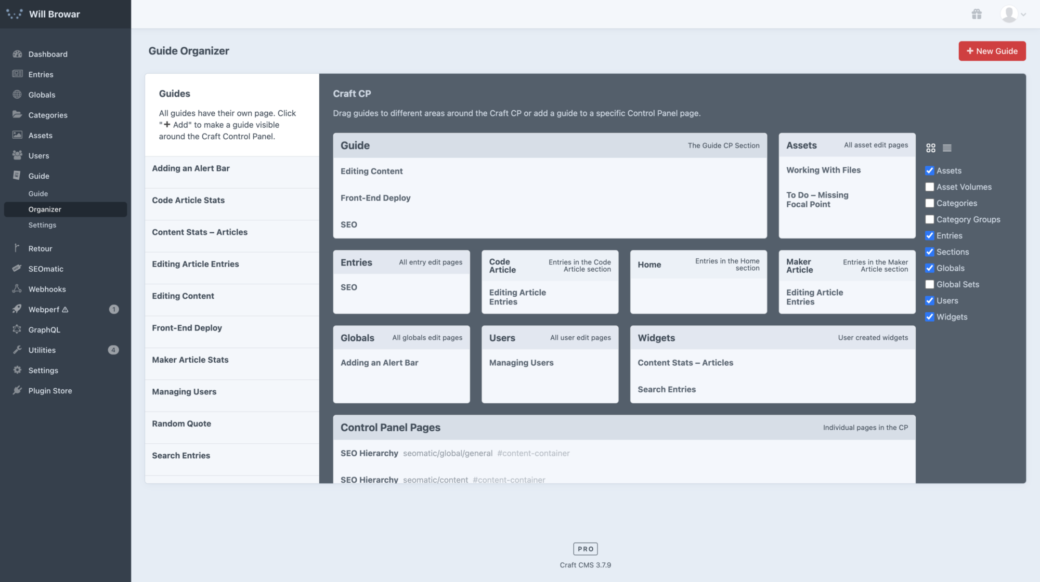
Here are a few other changes that the new Organizer brings:
Grouping Guides
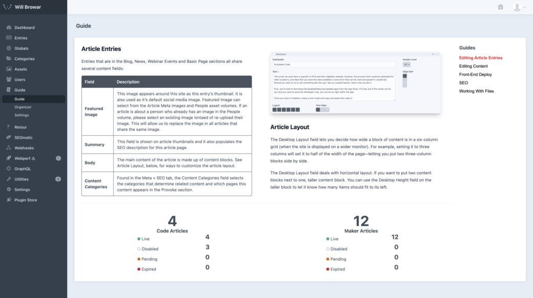
Each Guide automatically gets its own page in the CP where you can link directly to it and treat it like a standalone CP page. If you would like to create a traditional CMS manual that contains a selection of guide pages, you can drop multiple guides into the Guide CP section homepage.
A navigation will appear in the top-right when more than one guide is dropped into the same area in the Organizer, so your CMS manual is easy to navigate.
Element Edit Pages
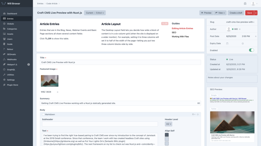
The modals and sidebar buttons on Entry, Asset, Category, User edit pages have been removed and guides are now located at the top of the page* so content authors don't miss out on important information and instructions. On Edit pages, guides include an element (or user) variable, letting you tailor the content of your guide to the specific entry or asset your are editing. Guides can now be dropped onto Global Set edit pages, too.
*If it feels like it’s in the way, a Guide plugin setting can move them to the bottom of edit pages, instead.
UI Element Picker
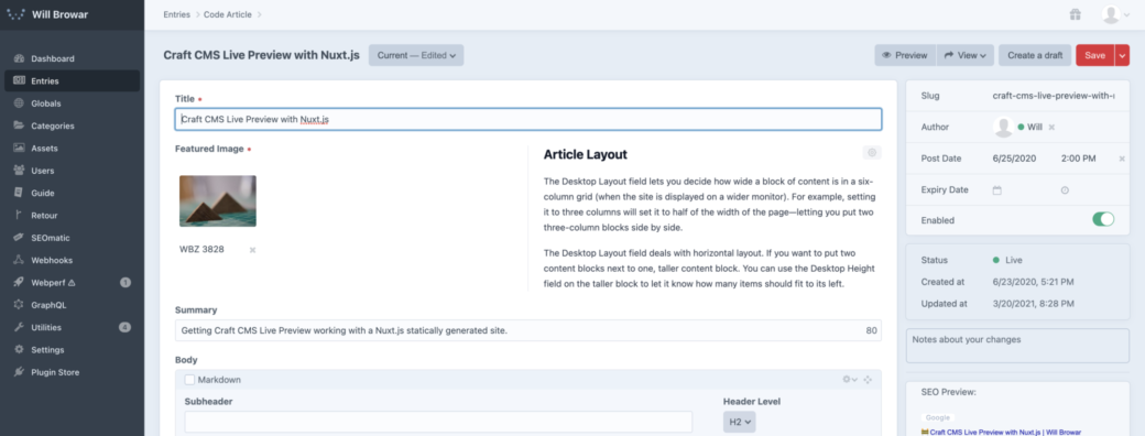
Instead of Guide 2’s setup where you selected a guide within a UI element and saved that selection in the Project Config, you can use the Field Layout Designer to place a Guide UI element as a placeholder. When you visit the edit page where the UI placeholder lives you can now select the guide that you would like to be displayed there.
Changing the selected guide is as easy as removing the current selection and then picking another.
Everywhere Else
In addition to widgets and these other CP areas, you can add guide content to any other CP page. You can set the URI of a specific CP page and use a CSS selector to move your guide content into unique areas around the CP. With a little bit of CSS—added in your guide’s Twig template—you can make your content fit in and find unique ways to help your content authors.
In a Ted Lasso voice: If you wanted to go ahead and put a guide about writing guides on the Guide settings page. Well, I guess you can go ahead and do that.
Editor
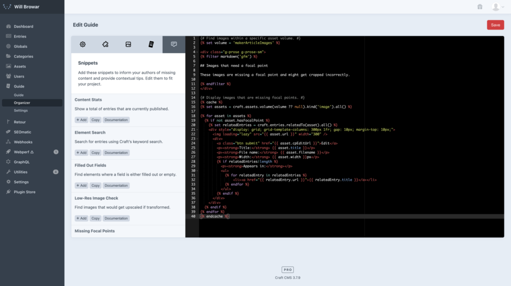
The Guide Editor has been updated with more components so a new set of tabs sits in the top-left to make it easier to find and embed images and other guide content into a guide.
The Guide Editor now includes documentation for each component to describe its use and to let you know what arguments can be passed in to each component.
Snippet Components
A new addition to the Editor is a tab, called Snippets. Here you can find dynamic and functional templates that you can use as starters for useful widgets, CP pages, and other guide content.
The Twig code here is meant to be customized and updated so it's written in a way that is meant to be understandable and easy to cut and move pieces around.
For example, there’s a snippet, called Low-Res Image Check, that’s meant to help you find and update images that aren’t big enough or else they may get upscaled or skipped during image transforms. The code it outputs looks something like this:
{# Set the asset volume you would like to check for images in. #}
{% set volume = null %}

{# Set the width to the smallest size that an image should be uploaded. #}
{% set width = 500 %}

{# Display a list of invalid images and instruct authors on what size is recommended. #}
{% cache %}
  {# Find all images within the targeted asset volume that are not wider than the "width" value. #}
  {% set assets = craft.assets.volume(volume ?? null).width('< ' ~ width).kind('image').all() %}

  {% if assets|length %}
<div class="g-prose g-prose-sm">
{% filter markdown('gfm') %}

## Images that are too small (less than {{ width }}px wide)

These images should be replaced with a .jpg that is at least {{ width }}px wide.

{% endfilter %}
</div>

    <div class="g-space-y-2">
      {% for asset in assets %}
        <div class="g-grid g-grid-cols-[var(--grid-cols)] g-gap-2" style="--grid-cols: 300px 1fr;">
          <img loading="lazy" src="{{ asset.url }}" width="300" />
          <div>
            {{ craft.guide.component('button', { attrs: { class: ['submit'] }, label: 'Edit Image', url: asset.cpEditUrl }) }}
            <p><strong>Title</strong><br>{{ asset.title }}</p>
            <p><strong>File name</strong><br>{{ asset.filename }}</p>
            <p><strong>Width</strong><br>{{ asset.width }}px</p>
          </div>
        </div>
      {% endfor %}
    </div>
  {% endif %}
{% endcache %}
You might want to put this on a standalone CP page, or put this in a widget on the homepage of the person most likely to jump in and replace the images.
While there is a setting to restrict this query to a specific volume, you can see that it's just a regular craft.assets query, so you could tweak that to be even more specific.
If you want to help content authors understand the context of these assets, you could even add a craft.entries query with a relation back to each image so you can display links to the pages they belong on.
For all of the times I’ve spun up Plugin Factory to create a one-off custom module, I hope to be able to whip up things like this and publish them just as easy as it it to create new entries in Craft. Hopefully this makes creating something like this more accessible to folks who prefer not to dive into the PHP inner workings of Craft and Yii modules.
Utility Classes and Vue.js
Guides are based in Twig and you could get away with doing everything in Twig and CSS (using the {% css %} tag). But if you want to get a little fancier, a small subset of Tailwind CSS is baked into Guide that focuses mainly on layout classes (flex, grid, position, box properties). It includes a few responsive variants to make it easier to create guides that are both mobile and desktop friendly. The code editor in Guide is set up to autocomplete for all of the prefixed utility classes, so start typing g- will automatically fill in the supported classes.
Vue.js is also used included so if you have a need for some extra interactivity you can set and retrieve variables in Vue’s template syntax. There are a handful of number, string, and boolean variables available to give you a little state to work with when you need it.
Editions
All of the features above are available in the PRO edition of Guide. The LITE edition uses some of the new Guide UI, but otherwise it’s unchanged from Guide 2—meaning you can create a CMS user manual in the Guide CP section using templets in your templates directory for free.
The PRO edition can be purchased in the Craft CMS Plugin Store and for the first 3 weeks, it'll cost $33.
