
Getting Glassy
Over the past few months I’ve been toying with different approaches to capturing the coolness of Apple Glass in CSS while also considering the readability and motion-sensitive problems that come along with it. The most obvious use case for it in my work is in the Admin Bar web component and Craft CMS plugin that I author. I’m happy to say that I think I found a good balance for a cool glass effect, made it opt-in and progressively available in the browsers that support the look, and made sure you have all the tools needed to make sure if you’re using the glass effect you can overwrite all of the styles that would affect accessibility.
The other day I released Admin Bar Component 1.7.x that brings the glass styles to Admin Bar Component. As of this writing the glass effect is really only available in Chromium-based browsers because it relies on SVG filters used in the CSS backdrop-filter property. It's enabled by a style() container query, which is also only available in Chromium browsers, so it really is still pretty limited and in many cases, users will still use the default version, which is tamer than the glass style but still has some visual appeal to it.
Theme Starters
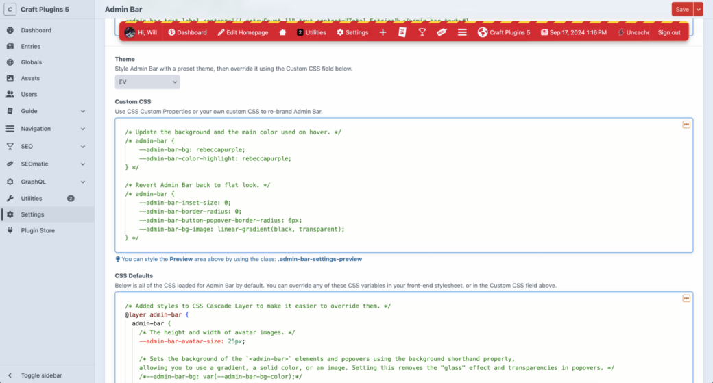
I wanted to wait until I had gotten over the glass feature hump and settled on changing a few CSS variables for Admin Bar Component before implementing another idea I thought of a few months ago: themes for the Admin Bar Craft CMS plugin. By default Admin Bar is a black toolbar with some white and red highlights that appear up mouse hover or when toggling popovers. The default look is meant to be very unassuming and can live on most any website without making any adjustments to the default styles.
On the other hand, I’ve made it a point to allow you to customize just about anything I can think of in the form of CSS variables. The default stylesheet is made with CSS Layers and with a long list of things that can be overwritten to make it as easy as adding CSS anywhere on your page that looks like this:
admin-bar {
    /* CSS variable overrides here. */
    --admin-bar-bg-color: oklch(0 0 0 / 0.5);
    --admin-bar-color-highlight: oklch(0.6 0.4 83);
}
The goal here is that if someone uses Admin Bar Component in a project, they can make it look like it matches the branding and rest of the look and feel of the rest of their app. In a Craft CMS project, usually that branding is tied to the company in a marketing site or the branding of an app that the CMS is driving. While I think many projects would be just fine with the default theme that comes with Admin Bar, a developer could spend a bunch of time tweaking the CSS variables to get Admin Bar to look just right based on their project’s CSS.
The idea of adding themes to Admin Bar came from thinking that maybe someone doesn't want the default theme but also might want some inspiration or might want a quicker way to get up and running and to make Admin Bar noticeable on the page (for the users who are logged in and have access to it). Also—truthfully—I wanted to make it really easy to use the new glass effect without making it the default style—and a big surprise for anybody updating to the latest version of the Admin Bar plugin.
So the themes were created to bring some variation to Admin Bar, but they also are meant to be used as a starting point for custom CSS theming. Say you like the new Stark theme, but you want to adjust the background color or button text colors. You can select the Start theme using the Admin Bar Plugin Settings page, then add CSS into the Custom CSS field. The CSS in that field will override any of Admin Bar’s default CSS variables along with any of them that are set by the Stark theme.
To see exactly what variables have been added for the theme, the Default CSS field has been updated to show all of the CSS used to render your Admin Bar—taking into account the theme and any custom CSS you've added.
Themes
The list of themes introduced in this new update are the beginning of this effort and more themes will likely get introduced in the future. Some might even get changed over time as Admin Bar Component changes or as new features get added to Admin Bar and Admin Bar PRO. Here is a list of the first round of themes:
The default theme for Admin Bar Component. Other than a few small changes it is mostly based around the default theme for Admin Bar Component.
The original Admin Bar theme based on the past 10 years of Admin Bar’s evolution. It removes the floating, rounded corner style that is the default of today’s Admin Bar.
A theme that matches the current Craft CMS control panel theme.
When you are deep into debugging CSS you typically use magenta or green, no? Well this theme might burn your retinas but you also can’t miss it.
Red clear coat and daylight white LED headlights were the inspiration for this theme.
The default Admin Bar theme with a glass refraction effect. This works best in Chromium-based browsers for now, but default should also work in browsers that currently don’t support these effects.
Inspired by the drink that inspired the name of the folks behind Craft CMS. WARNING: it’s a bit out there and it probably shouldn’t be used on any serious projects—unless of course, you want to.
Bringing a little bit of nature into your project 🌸
Fire up the engines and begin the count down for launch with this space age-inspired theme.
The calm of the ocean or the rush of a huge wave—based on how fast you scroll down the page.
What is your favorite thing to put in a glass? This was made for Brad Bell (or maybe Nick Offerman 🤷♂️).
Fin
I had fun creating these themes and I used inspiration from photos and things around me that I thought would spark some joy for developers and content authors alike. As always, this is just the beginning of this feature and I’d love to hear what you'd like to add to it. If you have a theme you’d like to add or if you would like to debate the right color to use for the Whiskey theme, drop me a note or open an issue on the Admin Bar repo.
Cheers!