A Plugin Feature Returns Home
Guide 1 included three widgets that got split out into their own plugin, called Communicator, when Guide 2 was released. The idea behind these widgets were that you could edit them in one place and all user Dashboards that included them would get updated immediately—as opposed to going user by user and updating widget content in each widget’s settings.
Guide 3 covers this functionality in that you could create a guide, add it to the Widgets CP area, and a user could add it to their Dashboard. Guide 3’s version is a little more advanced in that you can create the whole widget using Twig and you could also turn the widget content into it’s own page in the CP (Craft’s Control Panel).
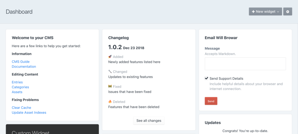
One of the three widgets in Communicator was a Changelog that followed Craft’s plugin format, showing features that were added, changed, and deleted. The idea is that as you maintain your Craft project—doing things like changing out fields and sections—you could update the changelog with info that’s relevant for content authors and other developers on the project.

Making Data
Let’s see if we can create a changelog Guide widget and CP page that is easy to keep up to date.
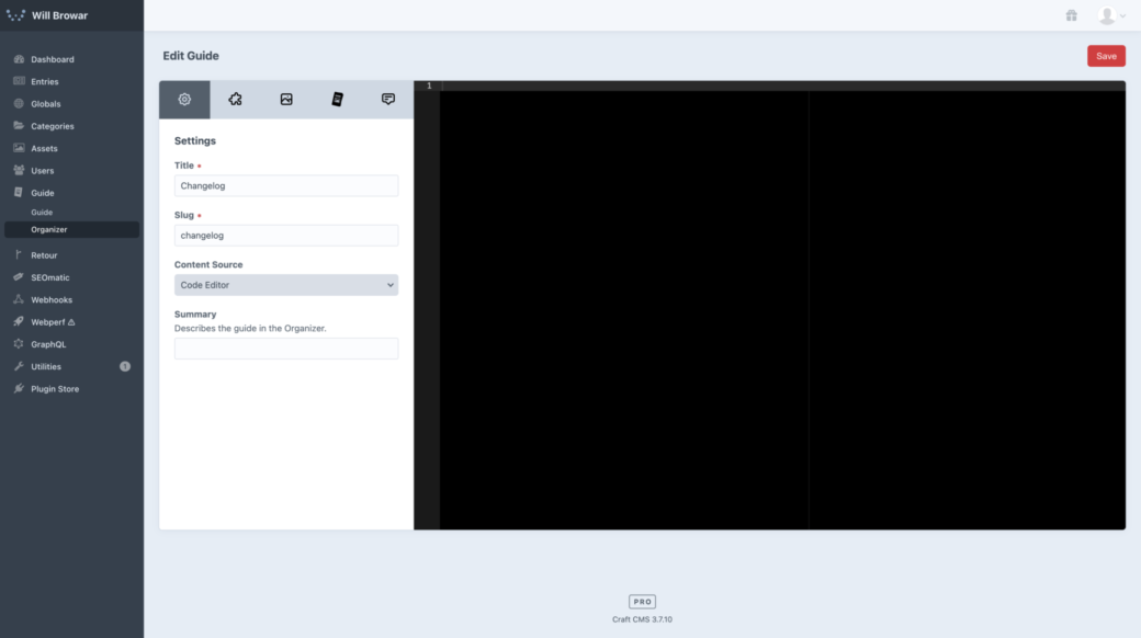
To start, go to the Guide Organizer page and click on "+ New Guide" to head to the Guide Editor. Here we can give it a name and let that generate the slug.
NOTE: To make it easy to see your changes as you go, save the guide and then in the Organizer click the View button to go to the guide’s standalone CP page. From there you can hit Edit and Save, as needed, to see your page come together as you code it.

The game plan will be that we’ll be creating a changelog note, store it into an array, then depending on whether you’re viewing it on the Dashboard or the page we'll show the appropriate amount of notes.
To start, let’s create a div and give it a class, called version. This will be the wrapper for each update.
<div class="version">
</div>
The first thing we want to display is the version number and the date. Feel free to play around with your own styling here, but if we want to do something similar to the Communicator setup, we’ll add this, <h2 class="g-mb-6"><span>1.0.0</span> Aug 27, 2021</h2>, so our code will look like this:
<div class="version">
  <h2 class="g-mb-6"><span>1.0.0</span> Aug 25, 2021</h3>
</div>
This is simply an h2 with a span tag around the version number. The class on the h2, g-mb-6, is a Tailwind CSS utility class built into Guide. If you’re unfamiliar with Tailwind, this is can be read as: g- (a prefix to avoid collisions) mb (margin-bottom) -6 (a Tailwind spacing unit similar to Craft’s default spacing)
The version number and date will start out the same size, but we can add a CSS block to style that to match the Communicator styles:
<div class="version">
  <h2 class="g-mb-6"><span>1.0.0</span> Aug 25, 2021</h3>
</div>

{% css %}
.guide-{{ guide.slug }} .version h2 span {
  font-size: 2rem;
}
{% endcss %}
This is a standard Craft css Twig tag. In it we’re starting off with .guide- then the slug of this guide. By doing it this way the slug will stay up to date if you decide to change the slug at a later point. Also, by included the slug here, we can make sure other guides aren’t affected by our custom styling.
Guide’s utility classes are meant for layout and box model properties, so we’re using this CSS block to change the font size of the span and then letting the date get styled by Craft’s default h2 style.
From here we have a header and now we need some content. This is where a Markdown component can help. In the Guide Editor, click on the "+ Add" button for the Markdown component to add a markdown block after our header:
<div class="version">
  <h2 class="g-mb-6"><span>1.0.0</span> Aug 25, 2021</h3>
<div class="g-prose g-prose-sm">
{% filter markdown('gfm') %}

## Heading

Content

{% endfilter %}
</div>
</div>

{% css %}
.guide-{{ guide.slug }} .version h2 span {
  font-size: 2rem;
}
{% endcss %}
At first this might look wrong, but because Markdown is sensitive to spacing we need to use shift+tab to outdent the Markdown content all the way to the left.
In here we can start to add our headers and unordered lists that describe our changes. The Communicator Changelog used emojis alongside its headers, so we’ll use the Unicode symbol for the 🚀 rocket, 🔧 wrench, 🚧 construction, and 🔥 fire emoji so they can safely be saved in our database:
<div class="version">
<h2 class="g-mb-6"><span>1.0.0</span> Aug 25, 2021</h3>
<div class="g-prose g-prose-sm">
{% filter markdown('gfm') %}
### 🚀 Added
- Features that have been added.
### 🔧 Changed
- Things that have changed.
### 🚧 Fixed
- Bugs that have been fixed.
### 🔥 Deleted
- Features that have been removed.
{% endfilter %}
</div>
</div>
{% css %}
.guide-{{ guide.slug }} .version h2 span {
font-size: 2rem;
}
{% endcss %}If you were to save this and take a look you’d see that you could just copy and paste this to create your changelog page and call it a day. That might be fine for a CP page, but we wouldn’t want to show all of your updates on our Dashboard, right?
So we need to make this repeatable and iterable. To do that lets wrap all of this in a set tag, along with some delineating comments, so we can set it to a Twig variable then push that variable into an array:
{# VERSION START – For each version copy this block and fill it out. #}
{% set version %}
<div class="version">
<h2 class="g-mb-6"><span>1.0.0</span> Aug 27, 2021</h2>
<div class="g-prose g-prose-sm">
{% filter markdown('gfm') %}
### 🚀 Added
- Features that have been added.
### 🔧 Changed
- Things that have changed.
### 🚧 Fixed
- Bugs that have been fixed.
### 🔥 Deleted
- Features that have been removed.
{% endfilter %}
</div>
</div>
{% endset %}
{% set versions = versions is defined ? versions|merge([version]) : [version] %}
{# VERSION END #}
{% css %}
.guide-{{ guide.slug }} .version h2 span {
font-size: 2rem;
}
{% endcss %}You might be questioning the version is defined ternary operator here. You could set a blank versions array at the top and just do a merge after each note, but it’s then something you need to avoid when copying and pasting to create a new version note. By doing it this way we can update our changelog by copying everything within the latest VERSION START and VERSION END comments, then pasting that at the top of our guide as self contained units.
Whichever method you decide to go with is totally fine as long as the concept of wrapping everything in a variable and pushing it into a versions array remains.
Displaying Our Changelog
So far we have a way to create version notes, now let’s display them. To make it easy to see where the data ends, let’s add a comment with a bunch of hyphens in it—to say, "everything above this line can be edited, but leave the stuff below it alone, bub".
Next we’ll add a plain div wrapper for our version note elements so we can avoid running into Guide’s default spacing between top-level elements.
In here we can go ahead and loop through our version notes and output them all.
{# ... (version blocks up here) ... #}

{# -------------------------------------------------------------------------- #}

{# Display changelog versions #}
<div>
  {% for version in versions %}
    {{ version }}
  {% endfor %}
</div>

{% css %}
.guide-{{ guide.slug }} .version h2 span {
  font-size: 2rem;
}
{% endcss %}
Now we have all of our version notes showing and we might want to add a little space between them. Back down in our css tag we can add some CSS to put margin, padding, and a border between each version element—as long as more than one version is shown:
{# ... (version blocks up here) ... #}

{# -------------------------------------------------------------------------- #}

{# Display changelog versions #}
<div>
  {% for version in versions %}
    {{ version }}
  {% endfor %}
</div>

{% css %}
.guide-{{ guide.slug }} .version + .version {
  margin-top: 3rem;
  padding-top: 3rem;
  border-top: 1px solid rgba(0,0,0,0.2);
}
.guide-{{ guide.slug }} .version h2 span {
  font-size: 2rem;
}
{% endcss %}
If you save this again and check out the CP page, we’re all set there. So the last thing to do is make it so when this guide is added to a Dashboard widget we only see the top-most version note.
Guide comes with a helper variable, guideDisplayArea, that’s value will change based on where the guide was placed in the Organizer. So in our case, we can check to see if guideDisplayArea is set to "widget" and then display just the one version post. In addition to that, we can add a Guide button component that creates a link from our widget to our changelog CP page.
After adding that, the final code for our guide looks like this:
{# VERSION START – For each version, make a copy of this block and place it at the top of this guide. #}
{% set version %}
<div class="version">
<h2 class="g-mb-6"><span>1.0.0</span> Aug 27, 2021</h2>
<div class="g-prose g-prose-sm">
{% filter markdown('gfm') %}
### 🚀 Added
- Features that have been added.
### 🔧 Changed
- Things that have changed.
### 🚧 Fixed
- Bugs that have been fixed.
### 🔥 Deleted
- Features that have been removed.
{% endfilter %}
</div>
</div>
{% endset %}
{% set versions = versions is defined ? versions|merge([version]) : [version] %}
{# VERSION END #}
{# -------------------------------------------------------------------------- #}
{# Display changelog versions #}
<div>
{% if guideDisplayArea == 'widget' %}
{{ versions[0] }}
{% else %}
{% for version in versions %}
{{ version }}
{% endfor %}
{% endif %}
</div>
{% if guideDisplayArea == 'widget' %}
{{ craft.guide.component('button', { label: 'See all changes', url: url('guide/page/' ~ guide.slug) }) }}
{% endif %}
{% css %}
.guide-{{ guide.slug }} .version + .version {
margin-top: 3rem;
padding-top: 3rem;
border-top: 1px solid rgba(0,0,0,0.2);
}
.guide-{{ guide.slug }} .version h2 span {
font-size: 2rem;
}
{% endcss %}

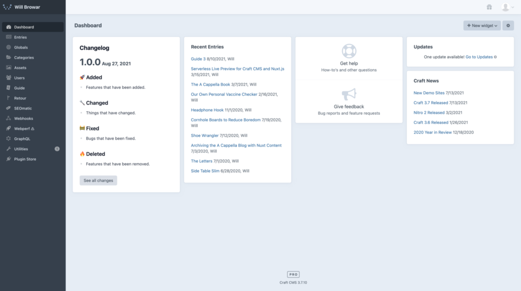
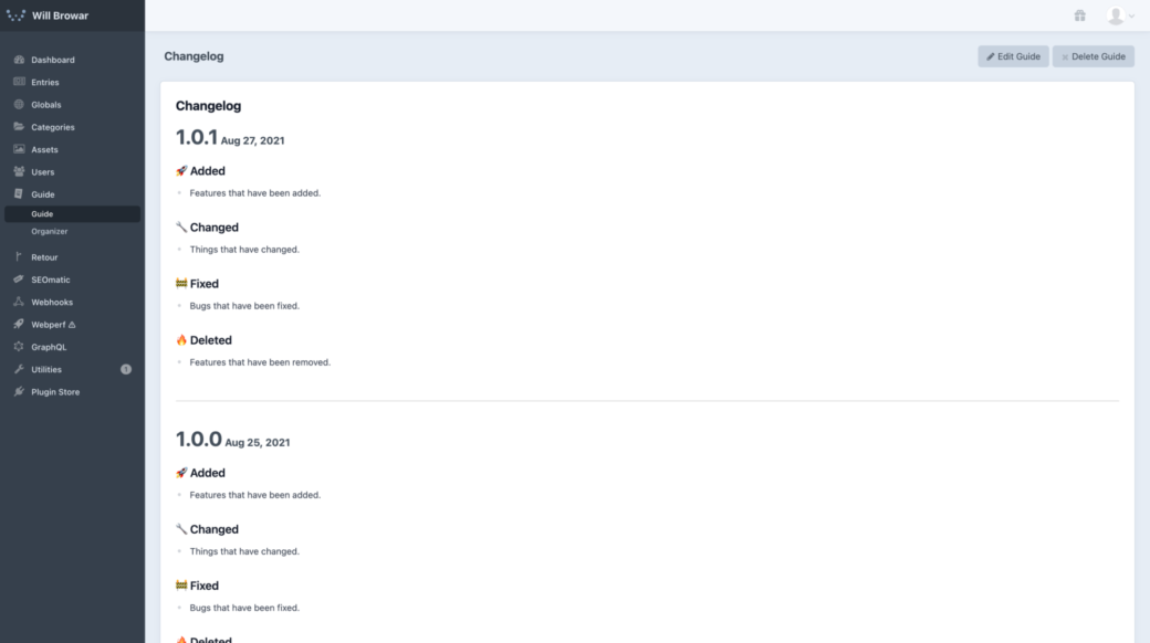
Our final page and widget should look something like this. This changelog setup will become a Snippet in an upcoming version of Guide 3, but in the mean time hopefully this article showed you a few things that you can use to create other useful tools within your Craft CMS projects.
P.S. On Abandoning Communicator (and Content Stats)
Craft’s Plugin Store is chock full of great plugins these days, but quantity isn’t a great metric if plugins aren’t supported and kept up to date (ask our friends in Craft’s Discord and on Twitter how they feel about lapses in plugin support). Over the course of the past year I've had a hard time keeping up with many things—leaving side-project plugins at a very low spot in my priority list. Both plugins currently work, but they weren’t getting proper updates and timely TLC.
Since there’s so much overlap between Guide 3, Communicator, and Content Stats, I decided that the better thing to do is put my time into making Guide flexible enough to cover Content Stats and Communicator’s use cases. As a side benefit, the Snippets feature in Guide makes it crazy quick to create a content stats or changelog widget that has the added benefit of letting you tweak its output to you liking:
Farewell, little plugins.
