
Welp, I think it’s fair to say I have renewed my membership in the enthusiastic developers club. See, in a recent blog post I outlined a few features I wanted to achieve in an update to Admin Bar Component. While the original idea was to make a few evolutionary changes and make one or two breaking changes, I wound up checking off everything on my list then introduced a few really big features.
For a full list of changes, you can check out the CHANGELOG on GitHub. In this post I won’t go over everything that’s new, but I wanted to highlight a few big changes and outline how the new features work.
Defining and Extending Elements
The first breaking change is that instead of <admin-bar> and its child-elements defining themselves as custom elements on import, you need to define each component you plan on using:
import { AdminBar, AdminBarButton, AdminBarCheckbox, AdminBarText } from 'admin-bar-component'

/**
 * Define the main `<admin-bar>` element and then define subcomponents.
 */
if (!customElements.get('admin-bar')) {
    customElements.define('admin-bar', AdminBar)
}
if (!customElements.get('admin-bar-button')) {
    customElements.define('admin-bar-button', AdminBarButton)
}
if (!customElements.get('admin-bar-checkbox')) {
    customElements.define('admin-bar-checkbox', AdminBarCheckbox)
}
if (!customElements.get('admin-bar-text')) {
    customElements.define('admin-bar-text', AdminBarText)
}
This might seem like extra work, but it also opens things up to give more control over when these elements are imported versus defined—which can help with different loading strategies. It also allows for extending each element—should you want to give them versioned names or add functionality to them.
While that block of code isn’t so bad, Admin Bar Component comes with a utility method that simplifies it a bit:
import { defineAdminBarElements } from 'admin-bar-component';

/**
 * Define the main `<admin-bar>` element and then define subcomponents.
 */
defineAdminBarElements(['button', 'checkbox', 'text'])
This does the same thing as the previous code block.
Cleaned-Up Package
Another breaking change is that the admin-bar-component package has been flattened out. This means that you can import the default CSS from the root of the package, admin-bar-component/admin-bar.css instead of from within a dist directory, admin-bar-component/dist/admin-bar.css.
While we’re looking inside the NPM package, you may notice a custom-elements.json file in there. This file is a CEM (Custom Elements Manifest) and it is a detailed list of all props, methods, and other parts that make up these web components. The CEM can be used with tools like the Web Component Toolkit and IDEs to make it easier for developer to include Admin Component elements in their projects.
Accessibility and Keyboard Navigation
The 2.x version of Admin Bar Component takes steps towards better accessibility. For one, I started testing with a screen reader and that led to adding some ARIA labels and some visually-hidden descriptions to various interactive elements. Some of them include default descriptions that can be changed using props or slots.
Along a similar vein to the accessibility changes, Admin Bar Component has a more consistent focus style and some additional work was done to improve keyboard navigation. Now you can tab through buttons and when you hit one that has a popover, you can press the up or down keys to open the popover. If the popover includes focusable elements, like <admin-bar-button>, <admin-bar-checkbox>, or standard input HTML elements, pressing up or down will continue to move focus on to the next element.
General Refactoring
Some tweaks were made to clean up CSS and to simplify markup needed to accomplish certain things. For example, if you wanted to create a link that included a label and a badge you could do something like this:
<admin-bar>
  <admin-bar-button button-href="/utilities">
    <admin-bar-text badge-content="10">Utilities</admin-bar-text>
  </admin-bar-button>
</admin-bar>
This would require some custom CSS overrides to make sure the color of the text in the <admin-bar-text> element changed correctly when you hovered over the <admin-bar-button>.
Badges have now been added as a prop on <admin-bar-button> elements, so you can simplify the code above like this:
<admin-bar>
  <admin-bar-button badge-content="10" button-href="/utilities">Utilities</admin-bar-button>
</admin-bar>
Mobile Mode and Toolbar Toggle
At this point in development I had accomplished my original goals. I began writing tests and using beta versions of the component in Admin Bar for Craft CMS. At this point I thought I was done and just wanted to spend some time dogfooding before releasing the 2.0 version. While testing on a mobile device, I got to thinking about how the old Admin Bar Craft CMS plugin used to have a mobile mode and how that might be a welcome feature over having to horizontally scroll a long list of links and widgets.
I put together a quick PoC branch to test it out and things came together to a point where it also led to a few other improvements.
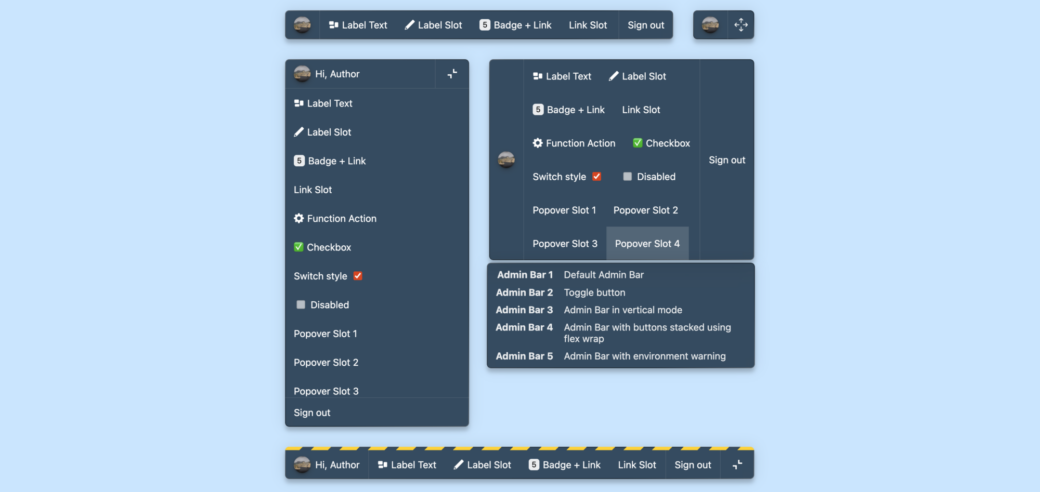
Vertical Mode
By default the <admin-bar> element is a horizontal toolbar and when the amount of buttons and text elements inside of it take up too much room, a horizontal scrollbar can be used to swipe them left or right. This isn’t ideal on really thin screens, so vertical mode can be a better experience. There are a few ways to enable vertical mode:
- Adding a
verticalprop on the<admin-bar>element. - Setting
admin-bar { --admin-bar-vertical: true }in your CSS. - Or automatically toggling between vertical and horizontal mode using a prop on
<admin-bar>, calledauto-toggle-vertical.
The vertical prop essentially sets --admin-bar-vertical: true inside of the <admin-bar> element:
<admin-bar vertical></admin-bar>If you want to display the <admin-bar> element as a vertical column you will need to write some custom CSS to give the element a height and to position it to where you want it to live on the page.
To display the toolbar fullscreen in vertical mode (such as on mobile devices). Adding the vertical-fullscreen class will fill the entire screen with the toolbar when using vertical mode:
<admin-bar class="vertical-fullscreen" vertical></admin-bar>If you intend to use the horizontal toolbar on wider screens and vertical mode on thinner screens, setting the auto-toggle-vertical prop is a helper that takes care of this for you.
The auto-toggle-vertical prop requires that you set it to a number and when the width of the <admin-bar> element changes it will automatically switch between the horizontal toolbar and a toggle button. When the toggle button is clicked, the toolbar will appear in vertical mode.
Combining the auto-toggle-vertical prop with the vertical-fullscreen class will make it so when the toggle button is clicked, the toolbar will fill the screen:
<admin-bar class="vertical-fullscreen" auto-toggle-vertical="700"></admin-bar>In this example, the toolbar will switch to vertical mode when the <admin-bar> element is thinner than 700 pixels wide.
Getting Admin Bar Component Out of the Way
The toggle button mentioned above is part of another new feature. You can collapse <admin-bar> and reduce it to a toggle button by adding the toolbar-toggle prop. When the full toolbar is shown, a collapse button will appear on the right side of the toolbar. When clicked, the toolbar will collapse to a single toolbar toggle button. Clicking the toolbar toggle button brings it back to the full toolbar.
If you really want to get <admin-bar> out of the way, you can also add the toolbar-toggle-drag prop. When <admin-bar> is collapsed down to the toggle button, you can grab a drag handle and move it with the mouse or on a touchscreen.
<admin-bar toolbar-toggle="toolbar" toolbar-toggle-drag></admin-bar>This example would toggle between a horizontal toolbar and a toggle button with a drag handle on it.
All of these new features are set up so they can be mixed and matched. Some new CSS has been added to the default CSS file that tries to make each combination work together. As always, it should be easy to override the default CSS to get Admin Bar Component looking and working how you want.
Fin
Admin Bar Component is in a brief beta while things continue to be tested. If you would like to see an example of these new features, check out the Admin Bar Component page and these CodePen pages: