
Article Updates
-
I've already made changes to how this web component works and this article is now out of date. I'm keeping it here because the rationale part is still relevant, but the web component is now a Light DOM component and it no longer requires the slot passthrough.
Little Layout is a plugin for Craft CMS that gives content authors the ability to visually adjust layout options for a given page, content section, matrix block, or for whatever else the developers sets it up to do.
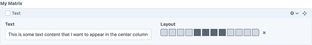
The field is designed to be simple to use and flexible enough that you could use it for all sorts of things, like text alignment or CSS flex and grid alignment. On this blog—run on Craft CMS—I use it to align text and other content across a six-column CSS Grid layout.
So if you’re looking on a tablet or desktop-sized screen, you might see this text laid out in a two-column layout—with this text off to the right.
The Problem
While dogfooding my own plugin, I've found what I think is a performance bottleneck. I use several Little Layout fields for each matrix block of content, and each article may include dozens of blocks, therefore the amount of Little Layout fields instantiated and active on the page grows pretty quickly. What I've found is that the more matrix blocks I add, the more I start to see a slow down in performance around the rest of the page. Typing in a textarea text box starts to lag and adding images and links to other relational items takes a few seconds.
I’ve used Craft CMS for a while and it tends to be very performant at its core, so based on the few plugins I use on this personal blog, I have to suspect that my Little Layout fields could be the culprit. I started thinking of potential theories for what seemed to be a memory or CPU leak:
- For one, I used Vue 3 to create Little Layout’s field and settings page. Each field instance calls Vue’s
createApp.mount()method to create a new Vue instance for each field. On a page with maybe 10 Little Layout fields you may not notice any issues with this, but as you create a new matrix block a new field instance is added, and that means a new Vue instance is created and running on the page. - Another potential problem could have been a
ResizeObserverI had on each field, watching to see if the field would need to horizontally scroll. If it did, this put up a message to the author letting them know they could scroll to the right to access the other fields.
Solutions
For the ResizeObserver issue, I was thinking of coming up with a CSS-based solution. I thought maybe the new :has() selector or some of the new scroll-related CSS features would help, but I haven't I haven’t found the solution for this yet. Because the feature was more of a helper, I removed the observer for now. You can still horizontally scroll, but there won’t be a message that pops up.
Regarding the Vue issue, I spent some time thinking through some potential solutions:
- Instead of creating a new Vue app for each field, I could find a way to create one Vue app and see if I could share the instance via Vue’s Teleport feature. I sill haven't thought through how this could actually work but I have a feeling the performance gain won’t be very big.
- Another solution could be to try to switch to the Craft CMS internal Vue asset bundle instead of bundling in my own version of Vue in my plugin JS. I don’t think it will help because I think while it might reduce the JS bundle size it won’t reduce the amount of CPU and RAM used for multiple Vue instances.
- Finally, after learning a little more about web components, I thought maybe this is a good use case for a set of web components to replace my Vue components. The change of framework shouldn’t affect the content author as long as the way the field works and its output remain the same, but if I can get a little closer to the metal with web components I thought I could at least explore this option by refactoring the Control Panel (CP) field first.
I went with the web component approach first, refactoring from a set of Vue single-file components (SFC) to a set of Lit-based web components. I've pushed this up to Packagist and as I type this blog post I'm going to see if I notice any improvement over the Vue version of the field.
Why Lit?
The short answer is because Dave told me to use it.. I wanted to start with vanilla web standards first, but I quickly found that things like reactive properties and render loops involve a lot of the work that web component frameworks are great at mitigating. Templating would also make a big difference since rendering this field requires loops and conditionals based on user input.
I think it’s still good to learn these standards, but since this isn't a web component I'm sharing as a library I felt like I had a little more freedom to work with dependencies that provide some extra helpers—as long as they are an improvement over my existing Vue setup.
As someone who’s spent time in Vue more than any other front-end framework (other than maybe jQuery), I am very fond of the things a Vue SFC gets you. I was really happy to find some equivalents in Lit that made porting the components over easier.
Register Once, Use Everywhere
So in the Vue version of the Little Layout field I needed to detect when the field was rendered onto the page (via Twig) and then I needed to call a JavaScript function that kicks off initializing Vue and attaching it to that field’s markup. This had to work both when the page initially loads, and whenever a field is created within something like a Matrix or Super Table field, so it was set up to get the name of the newly created field, match that up to an element on the page, then use a JS function to mount the component via Vue.
Web components are much more elegant here. When the page loads I can load a JavaScript file that registers my web component as a custom element on the page, based on the name of my choosing. So I have a script that defines little-layout-field as a custom element and whenever that element shows up on the page the web component will be used to render it. This means when new matrix block creates a new little-layout-field element I can pass in some props to define the settings for the field and rendering happens automatically.
import { LittleLayoutField } from './components/LittleLayoutField'
import { LittleLayoutFieldControl } from './components/LittleLayoutFieldControl';

// Register light DOM field component that includes input element for the page.
customElements.define('little-layout-field', LittleLayoutField);

// Register shared layout component (including layout boxes).
customElements.define('little-layout-field-control', LittleLayoutFieldControl);
Light vs Shadow
As you can see in the snippet above, I’m actually registering two web components to the page. This follow a pattern from the Vue setup where I have a shared component that displays the layout boxes and handles the majority of the author’s interactions, then I have a wrapper component for the content author’s field and another wrapper that is used in the field settings page.
So far with this refactor I've only ported over the content author field, so refactoring the settings field component is to come—if this experiment winds up being the solution to go with.
This pattern also helps with something I was struggling to figure out around web components. By default, Lit renders your template into the Shadow DOM. This is great for scoping your markup and your styles, but I wanted the input field to be rendered outside of the Shadow DOM so it can be accessible if Craft’s built-in JavaScript needs access to it.
In my LittleLayoutField component, I switched the rendering mode to target light DOM with the createRenderRoot() method:
/**
 * Changes the render mode for this component from shadow DOM to light DOM.
 */
protected createRenderRoot() {
    return this;
}
The resulting markup looks like this:
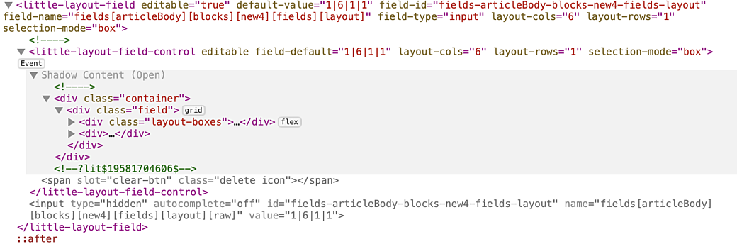
You can see here where Shadow Content starts within the little-layout-field-control element, but everything else is rendered on the page as normal elements.
In this setup, the content author interacts with elements within the little-layout-field-control element, the field value is computed there, then it's passed up to the little-layout-field component using a custom event (similar to how you could use emit to pass data up in Vue), then little-layout-field renders the input field.
From the Craft CMS standpoint, this input field is part of the overall edit page form and it gets submitted with the computed value. Then the developer can continue to work with that value as they would like in their GraphQL or Twig template.
Matching the Craft CP UI
One of the other challenges I ran into here is making sure my field continued to feel like it was part of the Craft CP design language. I know the layout boxes are sort of unique, but Craft CP has a defined color palette and things like icons that I wanted to continue to use.
The tricky thing with rendering in the Shadow DOM is that because its CSS is scoped, you can’t simply drop in a class that matches up to an existing style in the global stylesheet. For example, you wouldn't be able to get button styles, like the ones you’d get from the btn class. You also wouldn't inherit things like the text colors or global spacing properties. Imagine that there's a wall around everything in the Shadow DOM and you need to find a way to pass things through, or duplicate them within your component.
Luckily the Craft CP includes a whole lot of CSS Custom Properties. Most of the colors used in the CP are defined on the :root as custom properties, so pulling in colors was no issue at all. I had a few places where I wanted to slightly adjust a color and the new CSS color-mix() method came in handy.
The one thing that I did have an issue with is that in the Little Layout field there is a setting that lets you clear out the selected field data and this uses a button with the classes, delete icon on it. The icon class adds a global icon pulled in from a global stylesheet, and the delete icon selects the correct icon and then does some work to make sure it’s centered and positioned correctly.
This icon and its interactions wouldn’t be hard to re-create, but because the Craft CP styles could change at any point, I wanted to utilize the original styles from the original stylesheet. The way that Craft’s CP resources are loaded includes a unique hash in the file name, so in order to load the stylesheet, I'd need to pull it in via PHP first and then pass the path to it into the web component. While I think the web component could load that CSS file, it would mean a double download penalty for the user.
Again, Lit has a solution that worked in my light DOM/Shadow DOM setup. Lit uses the web standard for using slots to let you pass elements into web components as child elements.
The button in my little-layout-field-control component is rendered like this:
protected render() {
    return html`
        <div>
            ${this.clearable && this.editable && this._hasSelected ? html`<button type="button" class="clear-button" title="Clear" aria-label="Clear" @click="${this._clearButtonClicked}">
                <slot name="clear-icon"></slot>
            </button>` : nothing}
        </div>
    `;
}
There is more code in this render method, but it’s been removed in this example.
Notice that the button doesn’t include the delete icon classes, because this component wouldn’t be able to use them to render the icon in the Shadow DOM. To fix this, a slot, called clear-icon, has been added. The button can be clicked on to handle clearing out the field data, and the contents of the clear-icon will come in from the parent web component.
The parent looks like this:
protected render() {
    return html`
      <little-layout-field-control
        ?clearable="${this.clearable}"
        ?editable="${this.editable}"
        field-default="${this.defaultValue}"
        layout-cols="${this.layoutCols}"
        layout-rows="${this.layoutRows}"
        selection-mode="${ this.selectionMode }"
        @value-updated="${this._fieldValueListener}"
      >
          <span slot="clear-icon" class="delete icon"></span>
      </little-layout-field-control>
      <input type="hidden" id="${this.fieldId}" name="${this.fieldName}[raw]" autocomplete="off" value="${this._fieldValue}">
    `;
}
Here we are rendering the little-layout-field-control component (as a child component) and passing a plain old span with the delete icon classes on it as the clear-icon slot. Because this file is rendered in the light DOM we'll get any styles added onto the page, even though it gets nested into the markup of the Shadow DOM.
Speaking of CSS
In the Vue version of Little Layout I had used Tailwind CSS to handle everything CSS. I was using Tailwind with a prefix to help namespace my classes but otherwise I did things like copied color values from the Craft CP color palette into my config (this was before Craft’s CP colors were changed to CSS Custom Properties).
While I am generally fine with using Tailwind where it helps you out, using any framework CSS in Shadow DOM-scoped styles is a pain and it requires compromises and jumping through hoops. This is especially true for Tailwind.
So I bit the bullet and removed Tailwind from the web component, in favor of refactoring my template to use vanilla CSS. I was essentially re-creating my HTML markup anyway, so I used my old design as a guide, but wound up re-writing all of the CSS based on the new markup.
Lit lets you add CSS to the Shadow DOM-rendered elements via a styles property, using a css template function, similar to the html template function you use in the render() method. CSS for the light DOM elements can be styled by the page itself.
static styles = css`
  .container {
    overflow: auto;
    -webkit-overflow-scrolling: touch;
  }
  .field {
    --layout-box-size: 22px;
    --layout-boxes-gap: .25rem;

    display: grid;
    grid-template-columns: min-content minmax(0, 1fr);
    gap: .3rem;
    align-items: center;
  }

  // ... more styles
`;
Fin
So while I'm still testing out this approach and learning my way through the technology behind web components, I’m pretty happy with the results. I’d like to reach out to the Craft CMS community to see if anybody there can help beta test this new version of the field before releasing it as an update. Based on how that goes, I will likely revisit the settings Vue component and then fully remove Vue and Tailwind as dependencies on the front-end of my plugin.
If you have a Craft CMS project and you would like to try this out, you can change the version number of wbrowar/craft-little-layout in your composer.json file to use the version in the current development branch:
{
  "require": {
    "wbrowar/craft-little-layout": "dev-main"
  },
}
If you run into any issues, please go ahead and create a ticket in the Little Layout repo: https://github.com/wbrowar/craft-little-layout/issues