I’ve been working on this plugin for Craft CMS since 2017, called Guide. The idea behind the plugin is to make it easy to add pages and other custom things to the CMS Control Panel without needing to use PHP or write your own plugin. The whole thing started as a way to replace printed CMS user manuals that we used to hand out to clients during training meetings, so the logo for the plugin was meant to look like a little notebook.
Over the years I’ve looked for ways to make the plugin unique and to maybe add a little joy for its users. When I released version 3 in 2021 I included a little easter egg for the developer installing the plugin:
When you used the CMS to install the plugin you were redirected to a page where I had this 3D-animated notebook slide in from the left side. Once the camera slides over the book for the first time, the cover would pop open and reveal a page inside with a thank you message on the inside sheet. From there an animation plays on an endless loop until you click a button to take you to the settings page.
In order to make this animation happen I used Blender to create the 3D model of the logo and then exported that out into a format that lets me display it into the browser. Since I already had this 3D model created, I rendered it out and used it in things like the header on the plugin store page:
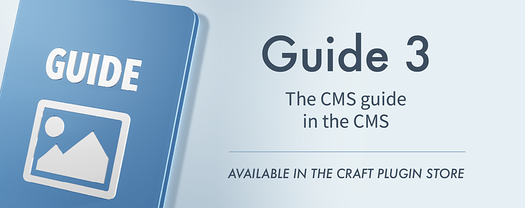
As I was recently updating the Guide plugin to version 5 I decided to keep this animation and the 3D logo around in the plugin and I moved it out of this easter egg screen and into a place where more folks might see it. While I was making changes to update the animation I got this idea...
The folks behind Craft CMS put on single-day and multi-day conferences and I was planning on attending the one closest to me, Dot One Toronto 2024. I thought it would be cool to have something to give to the folks who have helped me promote my plugin, or to just hand out to anybody who wants some extra SWAG.
What I wound up creating took some of the things I’ve learned in 3D printing and woodworking and I think it came out pretty cool.
Design
My original idea for this project was to buy a handful of Field Notes, print a 3D cover that was maybe 1mm thick and glue it onto the cover of the Field Notes top cover. I sort of played around with this idea with a 3D print I whipped up and realized that it would feel uneven having a plastic cover on just the front. Another issue is printing such a thin sheet isn't a good idea since it can warp or break easily.
I looked at my 3D model and decided to thicken up the front cover and use my printer’s multi-color print feature to make the white part of the logo stand out a little more. I wanted to essentially create a hard cover notebook out of the Field Notes by printing a back and front and when you open it up it would look just like it does in the animation.
I placed an order for a bunch of Field Notes to get the size right and to start testing this out.
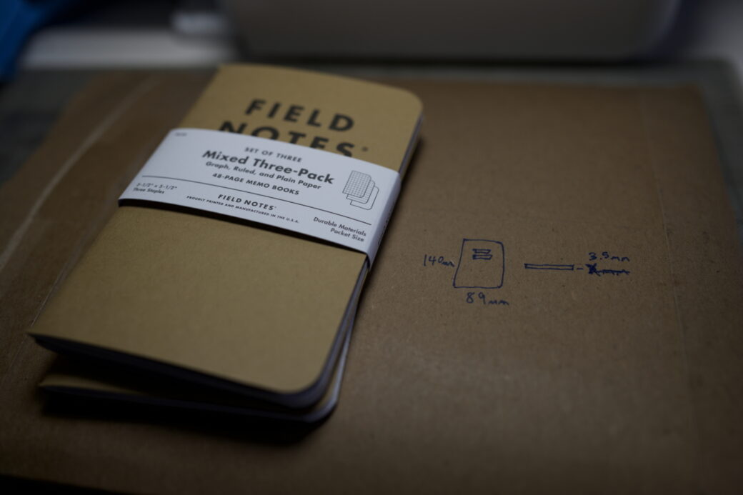
For reference, I landed on 89mm x 140mm x 3.5mm
I got the dimensions of a Field Notes book and used that to create a 3D model of that size to use as a reference.
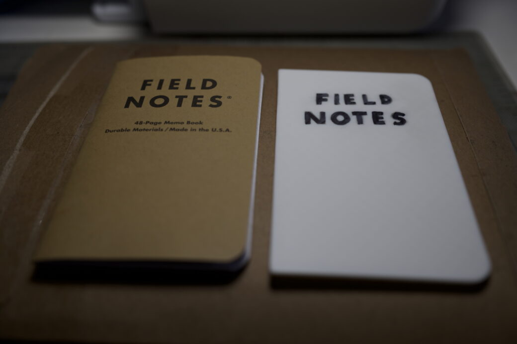
It took me a few tries to get the thickness right as when you look at a Field Notes they are not exactly a rectangle. The depth is higher at the side near the staples and while you can squash that down, I didn't want to mess with the notebook itself to make this piece work. So after some trial and error I got the size from the thickest portion and moved on from there.
With these 3D-printed notebook stand ins I started to think about how to model up the cover and how it might work if I glued it onto the Field Notes books. What I realized is that this original design wouldn't work. If you look at the binding of a hard-cover book you’ll see that it’s a little more complicated than just two sheets of cardboard stuck together—that there are places where the cover needs to contract to allow the book to open up.
I tried thinking about ways to make this work with 3D-printed parts and couldn’t come up with a good way that didn’t leave a weird gap or that made it feel natural to open and close the book. Looking online, some folks have created 3D models with hinges and ways to do something similar to how a hardcover book works, but they require books that are thicker than Field Notes.
I decided to scrap the idea of 3D printing the hard covers and I picked up some cardboard to think of some other ideas.
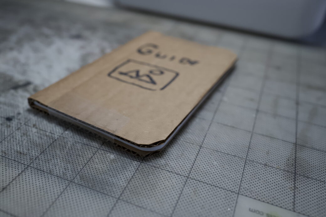
One of the ideas I had was to wrap the Field Notes notebook in U-shaped 3D print where it would sort of act as a protective case around the notebook. I used some tape to hold down the top and bottom and tested this out with one of the 3D-printed stand ins.
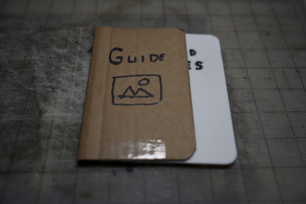
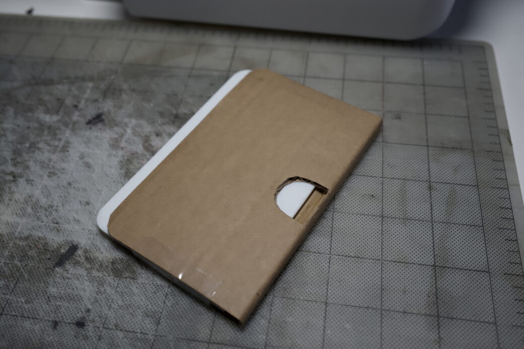
I cut a notch out of the back side of the cardboard to make it so you could push the notebook out when it’s inside. With that I had a good idea where to take it from here.
3D Modeling
One of the things I have learned in 3D printing is that there are some tricks you can use to make things look cooler. I didn’t want to sand or paint these pieces and I thought it was important that the letters in the logo were crisp and readable and that they fit together nicely. The best way I know to achieve this is to design your model to lay down onto the bottom layer of the 3D print—right on the printing plate.
I modeled out the first version in several parts based on how I wanted it to look and how I planned on assembling it. Thinking about things like printing supports and how to glue it together helped me decide on portions of the design.
I used the Field Notes stand in piece as a guide and built around that, giving me the right width and the thickness for things like these little sides that were meant to look like paper.
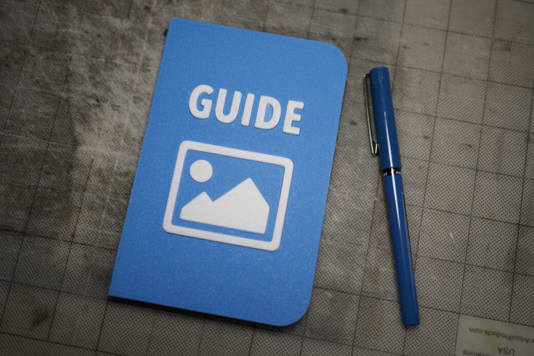
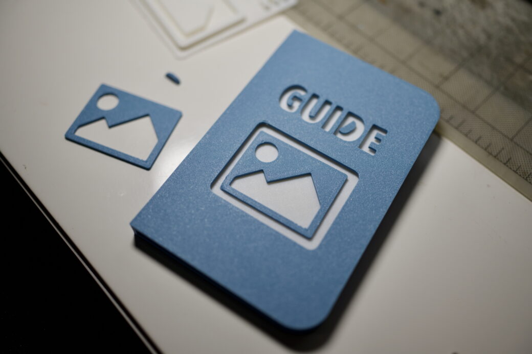
For the white letters that spelled out the word, GUIDE, I used the shape of the letters and the picture icon to cut out the shape on the top cover and I added a small kerf to make sure I had some room to slide them together once they were printed.
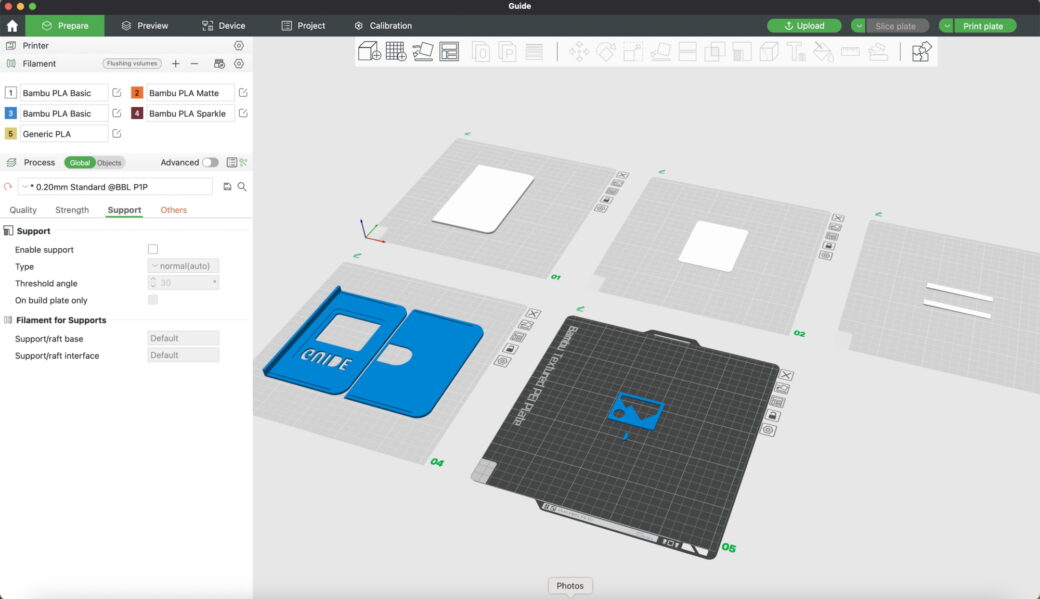
Build plates for each part of the print. Top row, left to right: Field Notes stand in, GUIDE letters, "paper" sides. Bottom row: top and bottom covers, parts inlayed into GUIDE letters.
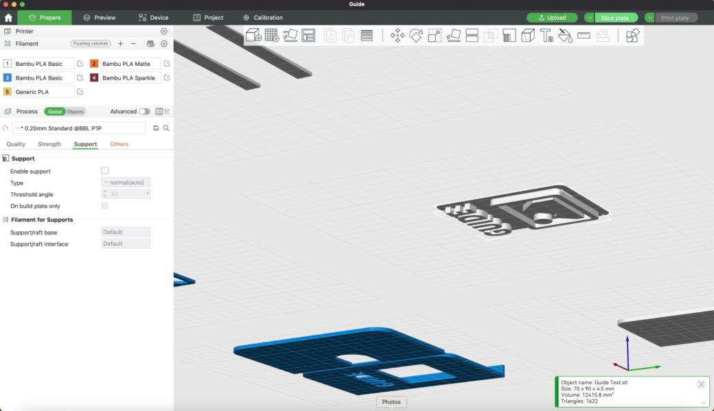
This screenshot is from below since the GUIDE letters are facing down so they can be printed directly on the build plate.
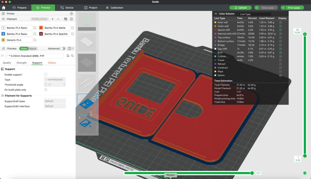
One of the earlier versions of the top and bottom pieces.
I wanted to test out the fit of the cover first, so that's where I started printing.
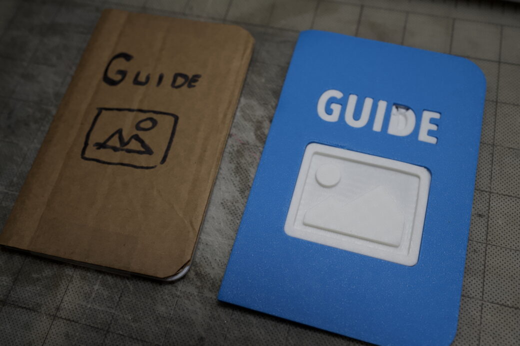
The fit of the letters and the top cover worked out great so I printed the rest of the pieces to see how they would fit together.
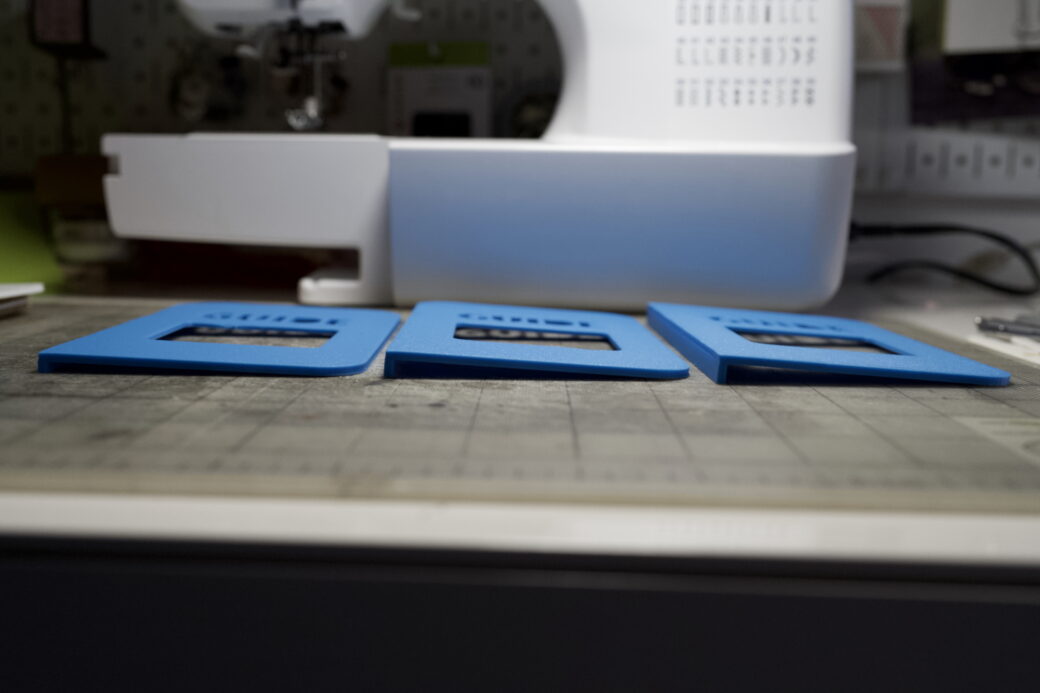
As I did a dry run I noticed that the depth wasn’t a great fit. I made a few iterations on the top portion to make it big enough so you could easily slide a Field Notes notebook in without too much resistance, but tight enough to hold a Field Notes in place without it falling out.
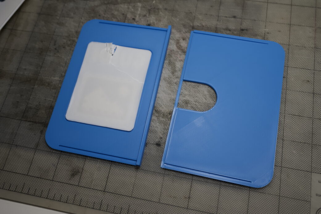
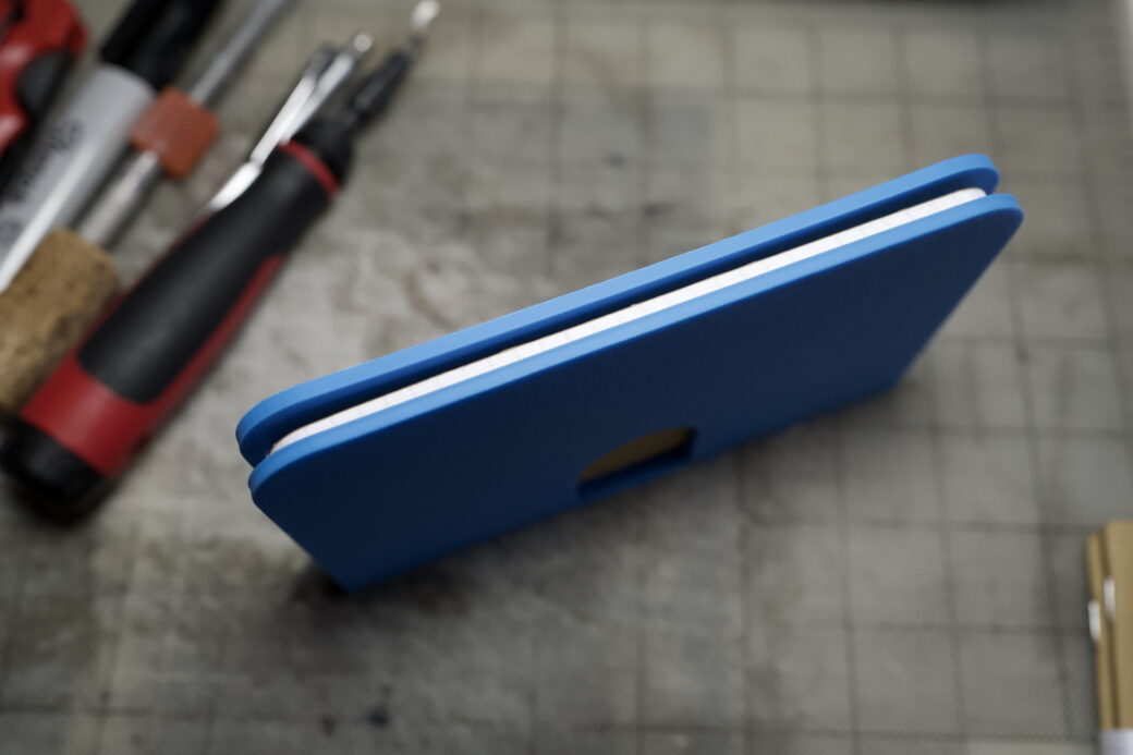
The top cover had the top face and then it also included the spine portion in sort of an L shape. One of the ways I could have put this together was to make the width of the bottom cover thinner to fit the thickness of the spine, then glue that bottom piece to the bottom of the spine. My concern there was that it might be hard to do this accurately and it might make a gluey mess.
One of the tricks I have learned in woodworking is that for a really strong hold, and to give you more control over how pieces fit together, you can use a little cutout, called a rabbet, that sort of acts like a groove to rest one piece into another. So instead of making the back cover less wide, I made the spine piece less tall by about 1mm, then I added a groove onto the back cover and offset it to the same height as the original spine piece. In a dry run this worked out great.
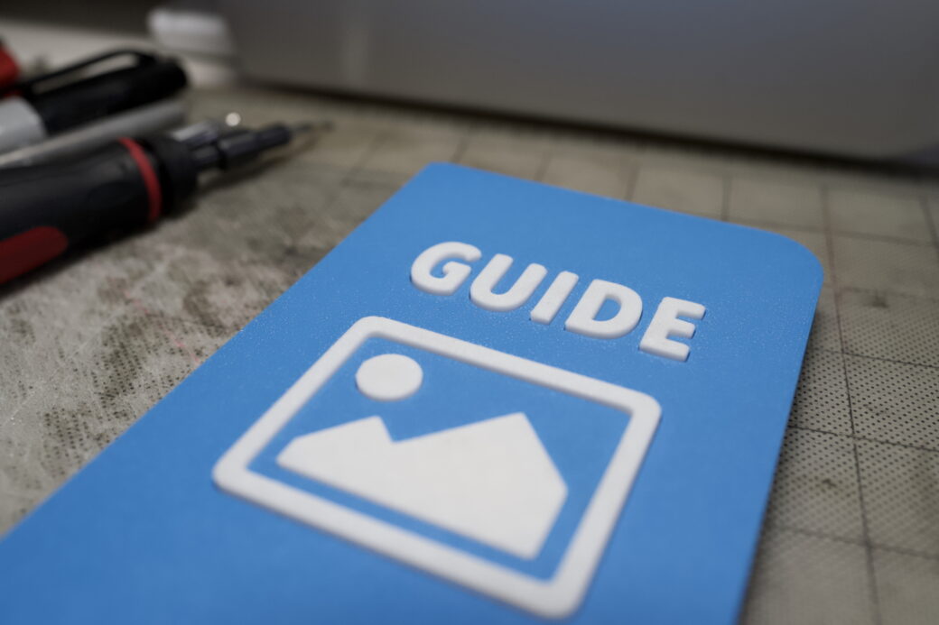
With the functionality working nicely, I spent the next few days dialing in the aesthetics. I tweaked the height of the GUIDE text to make it feel like the right height (mostly pushing it out more until it seemed tall enough).
I showed this to my wife to get her feedback. She had a great idea to add a little gap between the inner wall of the spine and the edge of the Field Notes book, giving you a little more room to slip your fingers behind the back edge of the notebook to help slide it out. I tweaked the height and width of everything slightly and added a few millimeters to the spine area on the bottom cover—everywhere except where the notch is. This change not only helped with the gap for your finger, but it also gave me more surface area to use when gluing the top and bottom parts together.
At this stage, I had a working prototype and I was ready to begin production.
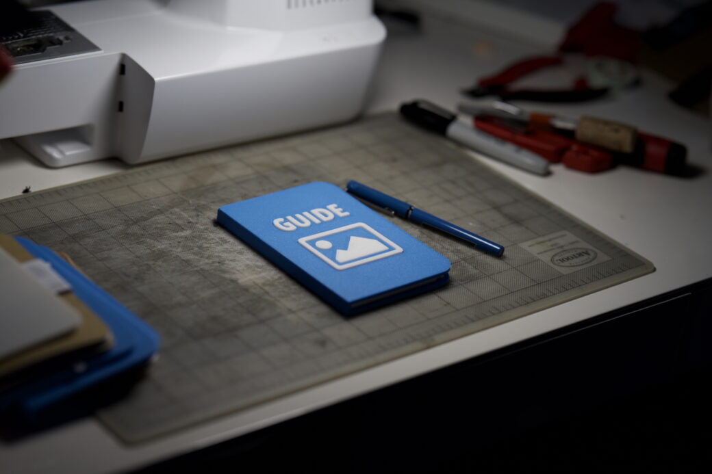
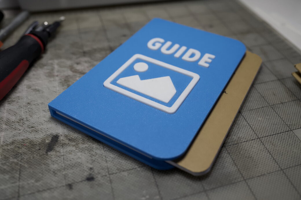
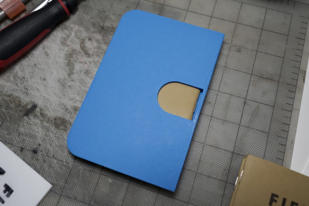
Material Change
I ordered the Field Notes notebooks first because they were a prerequisite for the design, and while waiting for them to arrive I also ordered 3D-printing filament. I already had some white PLA in stock (Bambu PLA Basic), and while I liked the Cyan color that I used for the prototype (also Bambu PLA Basic), I wanted to see if I could find a filament that matched the Guide logo color. Because my printer is a Bambu P1P I wanted to find one of their filaments, however, they didn’t have anything closer to the color, in a material I was comfortable using for the project.
I like using PLA for this kind of thing because it's easy to print and I have the most experience with it over other materials. I found a filament on Prusa’s store, in a color called Chalky Blue, however, it was a PETG material. I know that PETG can be a little more finicky and dialing in the temperature was important, however, PETG can be stronger than PLA and I know a lot of folks who print only using PETG when they can. So I placed an order and waited for it to arrive.
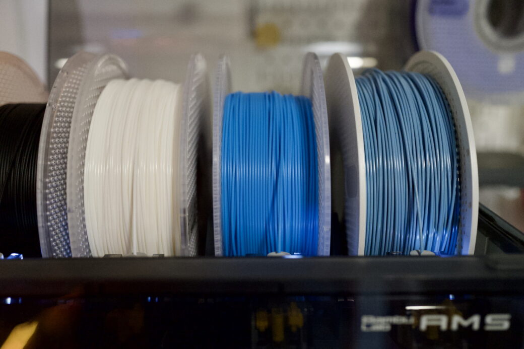
I had to re-spool the Prusa PETG to fit within my Bambu AMS. I used a drill, a bar from a dumbbell, and lots of patience to move the chalky blue filament to an AMS compatible spool.
I added the chalky blue PETG to my printer as a custom filament and set it up according to the heat ratings as written on the filament box. My first print with it was close but had some issues filling in some of the gaps on smaller areas. This affected the G and the U the most.
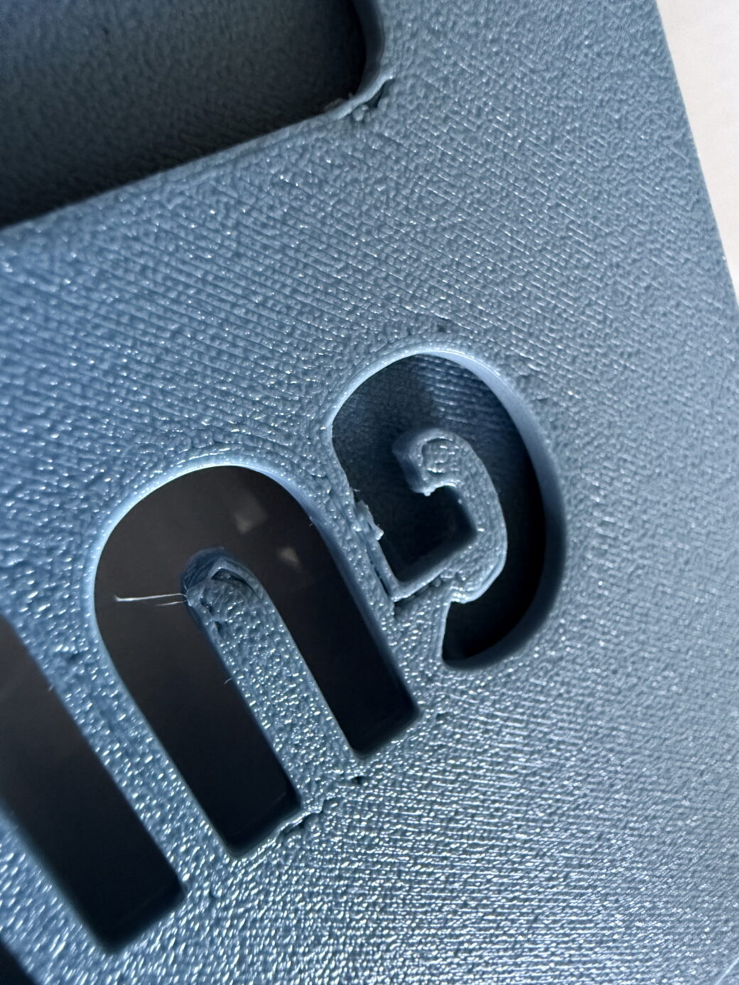
After spending some time dialing in the right temperatures and slowing down the speed of my printer, I finally got to a point where I thought it was good enough to start printing the final pieces.
Production
I made an inventory list of all of the pieces that need to be printed, so I can keep track of how many I needed. In a project this small it wasn’t too hard to keep track, but I did it out of habit.
I started off with the parts printed in white first. The little "paper" side walls were easy enough to print in one sheet. The GUIDE letters were also pretty straightforward to print, and I did those in only a couple of batches.
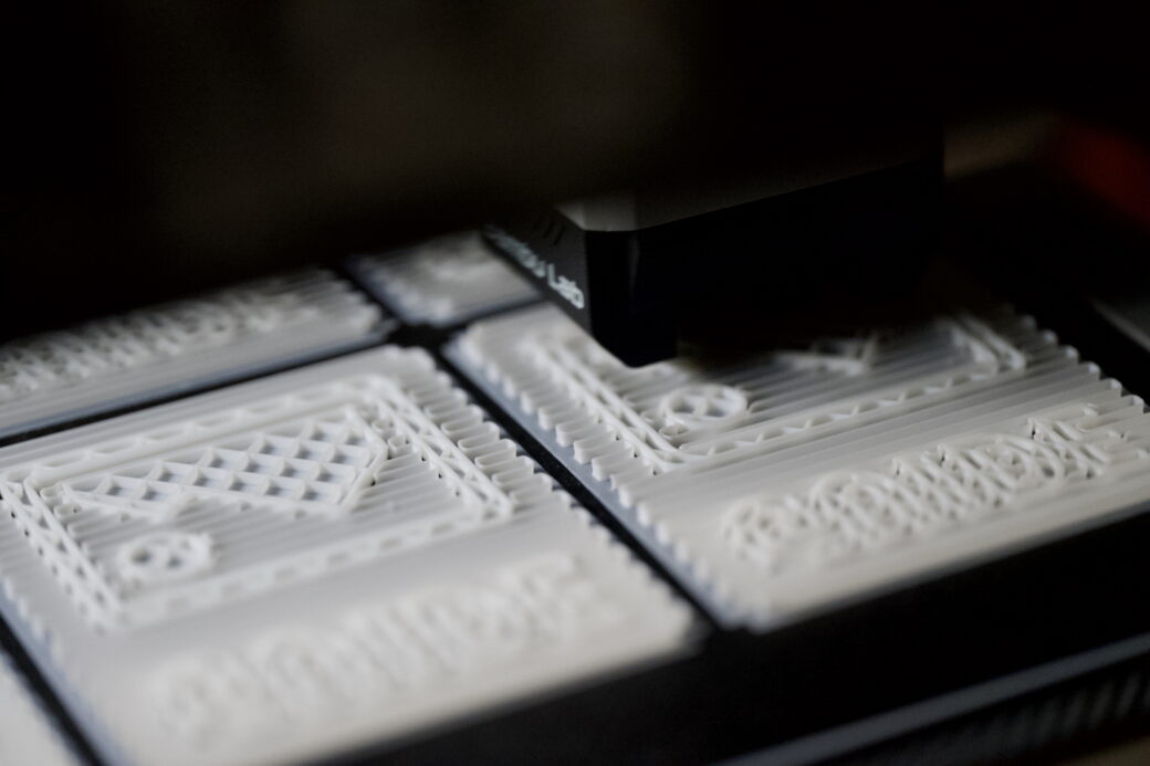
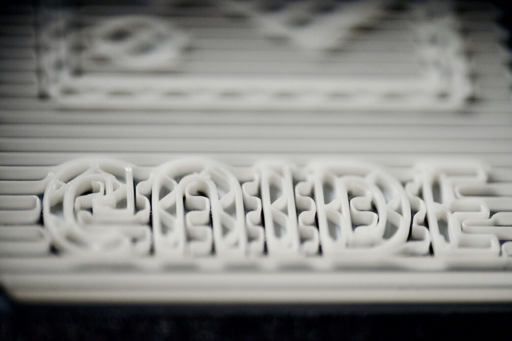
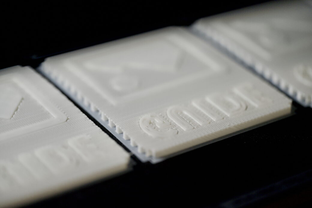
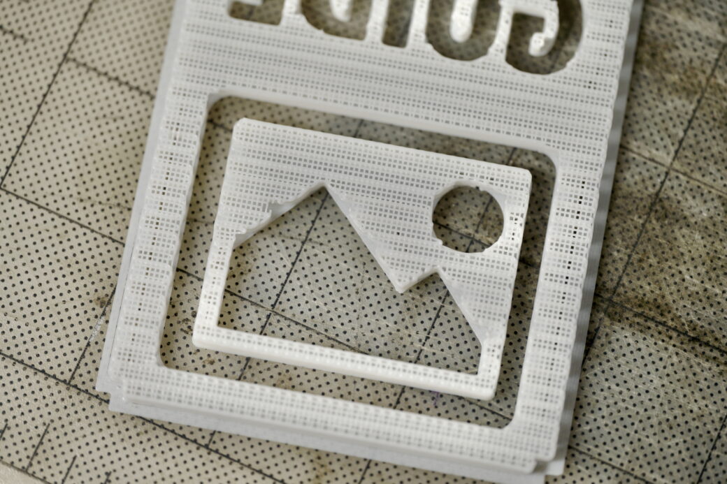
Even the supports for the GUIDE letters looked cool.
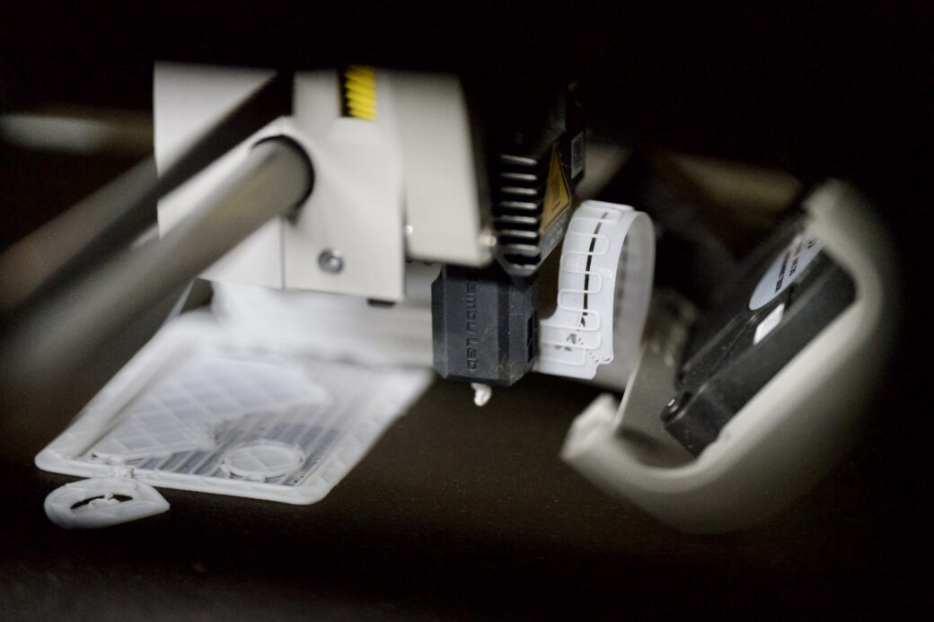
As everybody with a 3D printer knows, failed prints happen. At one point the printer head popped off from a print that wasn’t sticking correctly to the bed.
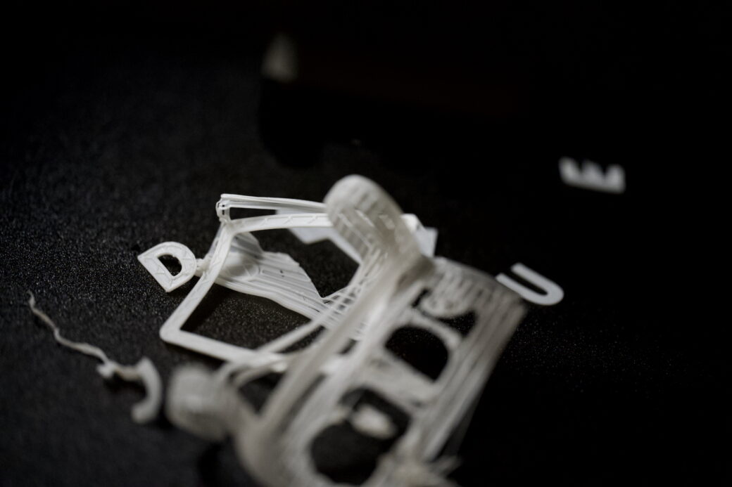
Next up were the parts inlayed into the GUIDE layer. This included the inside of the picture icon and the inner area on the letter D.
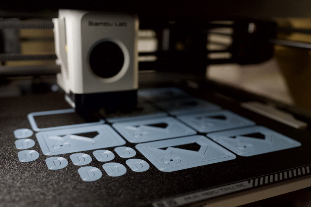
I cleaned up these prints and got them ready to glue into the GUIDE letter pieces. I followed this order because I knew that I had to have the GUIDE letters completed before I could glue them into the top cover. Then the paper sides and the bottom cover would be glued on last.
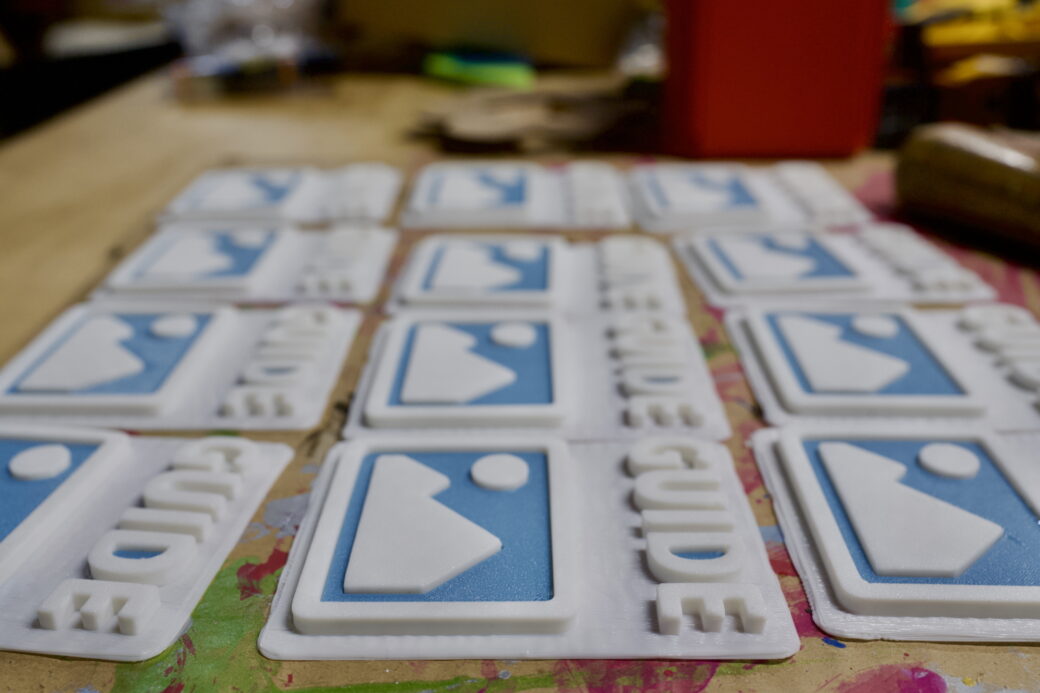
Over the course of the next few days I had printed out the rest of the top and bottom pieces. The bottom pieces were no problem, but some of the top pieces still had issues with small gaps. Everything was flat, but sometimes there were holes missing and I wouldn’t find out there was an issue until I pulled the piece off of the plate (this is sort of the downside to printing face down).
My goal was to hand out 10 of these, so I made a couple extras—just in case. I eventually got 12 tops that I liked and moved onto the next step.
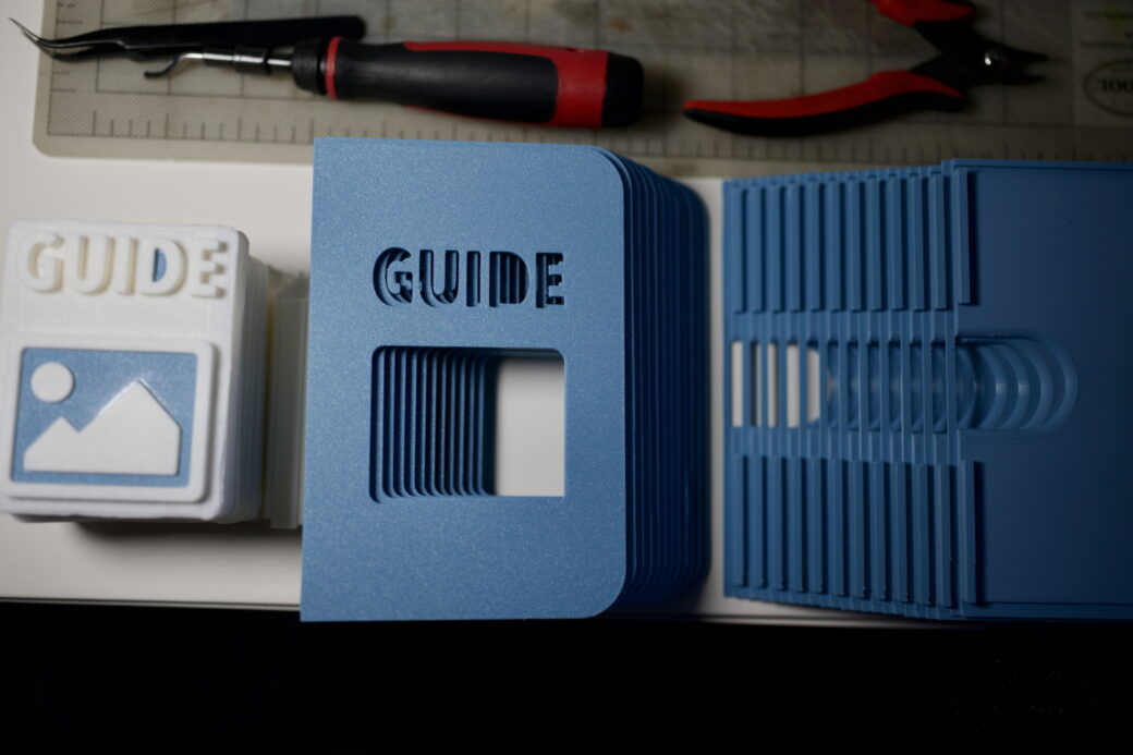
I used some things around my workshop to get the GUIDE letters to stay in place when gluing them into the top cover. I wanted to make sure these were fully cured before I started gluing the top and bottom pieces together.
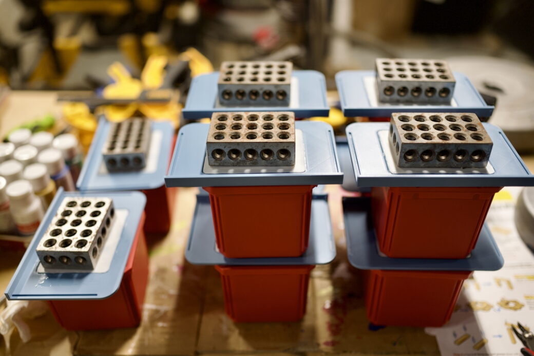
These metal blocks are called 1-2-3 blocks and the are just heavy enough to provide some weight without bending the top pieces.
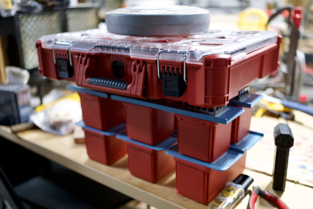
I used one of these tool cases to distribute out a 15lb weight and I stacked the glued pieces into two layers.
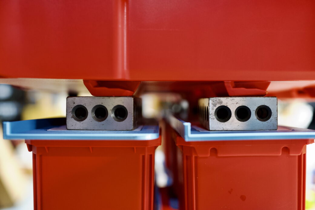
Once the tops were all set, I began gluing the rest of it together in batches. I used woodworking clamps to hold things together in two spots where I thought they needed them the most. These quick clamps are perfect in that they aren’t too strong and the pads that touch the 3D printed parts didn't leave any marks.
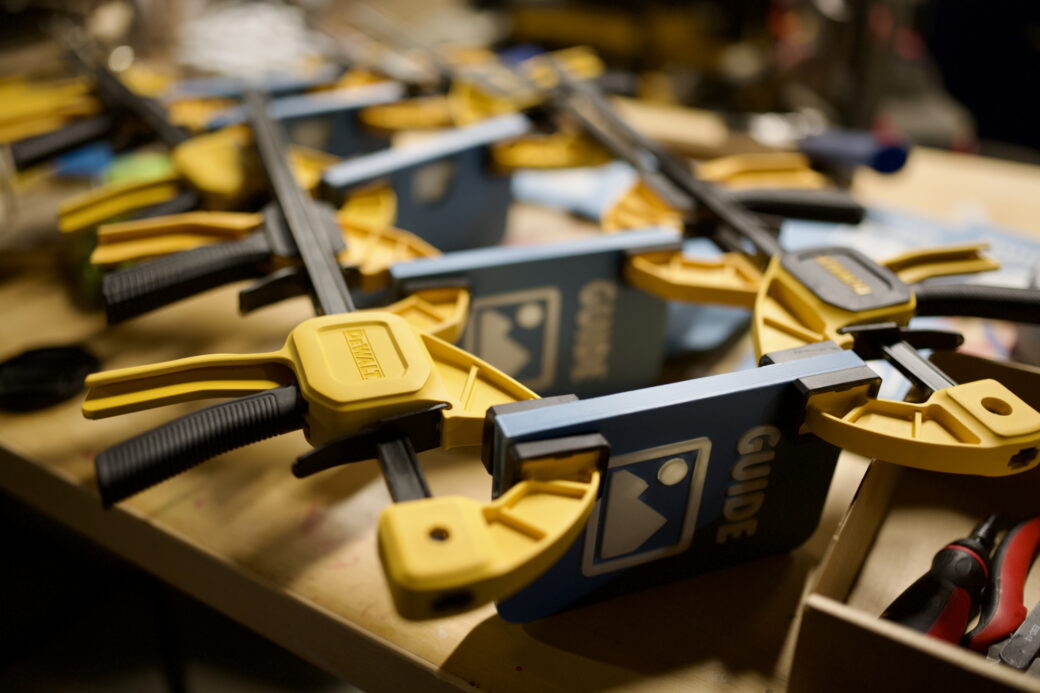
I gave everything a good 24 hours to cure and then started inspecting them, making fixes, and cleaning them up where I felt like it was needed.
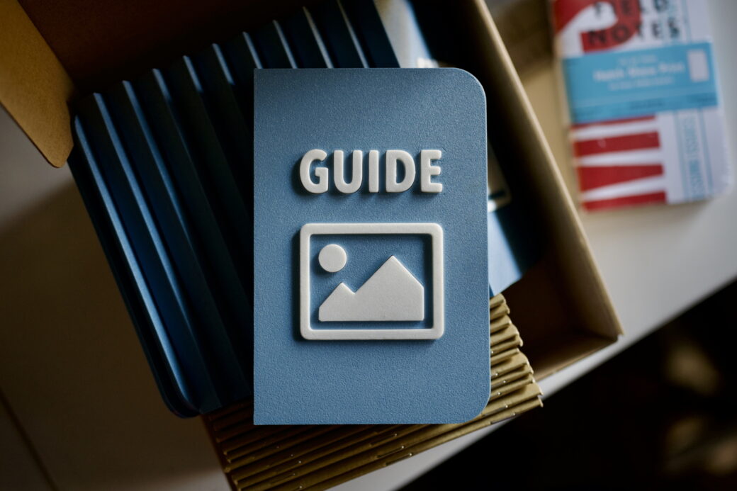
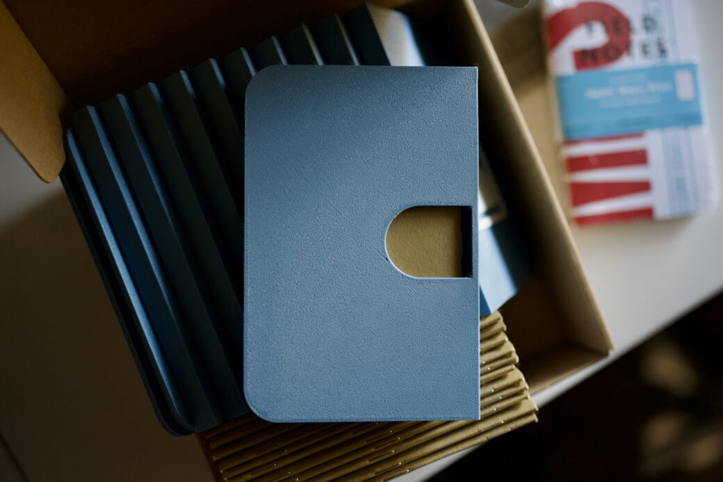
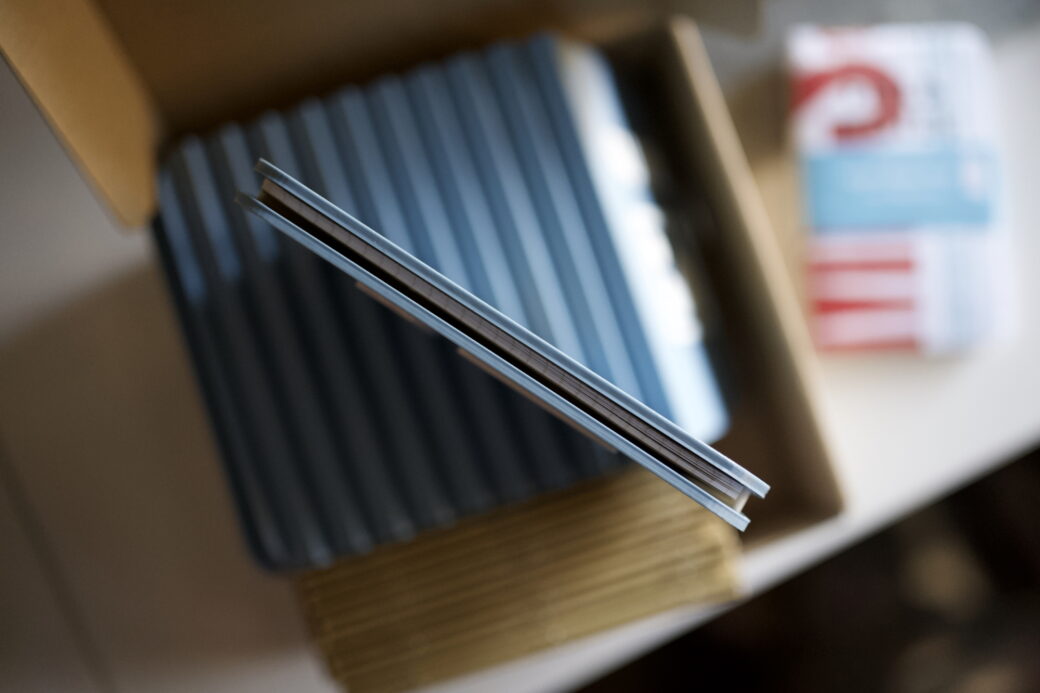
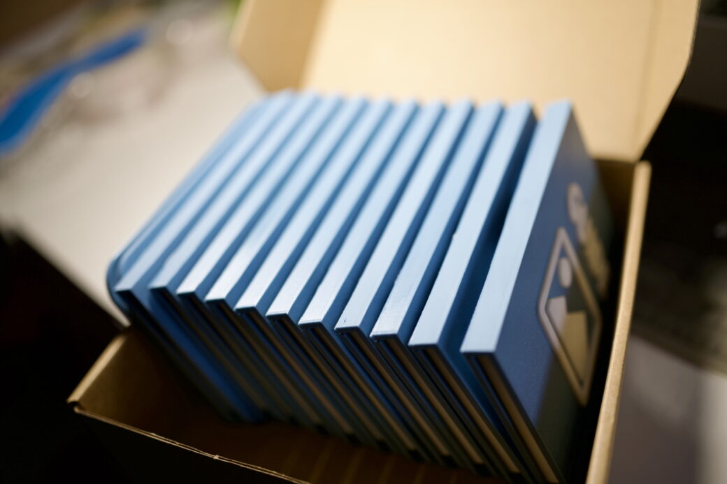
This project was sort of a good way to use all of the things I’ve learned about 3D printing so far. I didn’t feel like I had run into any major, unforeseen issues at any point. Most of the refinements were based on having the final thing in hand and taking some time to get a feel for what works and doesn’t work.
The only thing I would try to do better next time is work on figuring out a cleaner way to glue the 3D parts together. I used a two-part epoxy and I was sometimes more worried about the epoxy hardening before I used it that sometimes I put on too much and had to come back and clean it up later. Just like a woodworking project, each one has one or two minor things that make it not perfect, but I'm okay with that.
I’ve been doing a lot of promoting for the Guide plugin in Discord, Mastodon, and on my blog and doing that sort of thing doesn’t feel natural for me to do, so putting my energy into a little thank you piece felt like a good change of pace.
