
Before 2010, our approach to websites on mobile devices was that on iOS we were okay to leave things as-is if you can pinch and zoom into the content and carry out all of the primary functions of the website. If a site had Flash on it we would provide a non-Flash HTML fallback that represented the Flash portions but without the animations and some functionality.
But CSS was improving and approaches to web development were evolving to start making the experience on mobile devices better for customers.
Data Publishing
One of our longstanding clients at Dixon Schwabl was a telecom company in the Lowcountry, called Hargray Communications. Another company that was related to Hargray, called Data Publishing, provided the services you might get from the Yellow Pages or similar data providers. We created a handful of search websites under the Data Publishing brand, starting with a redesign of the main Data Publishing site in 2010.
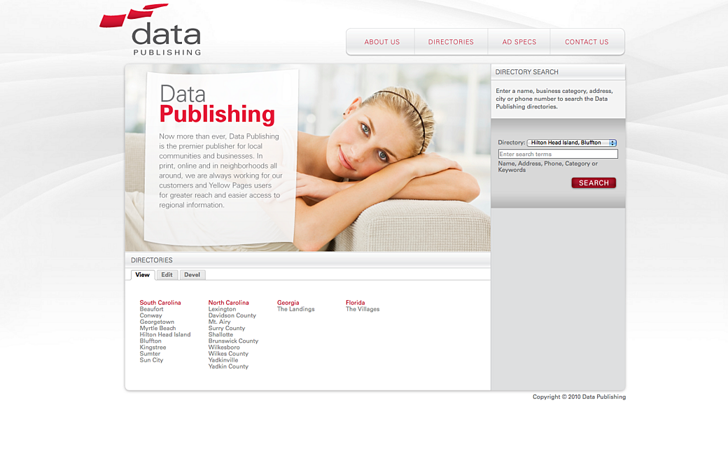
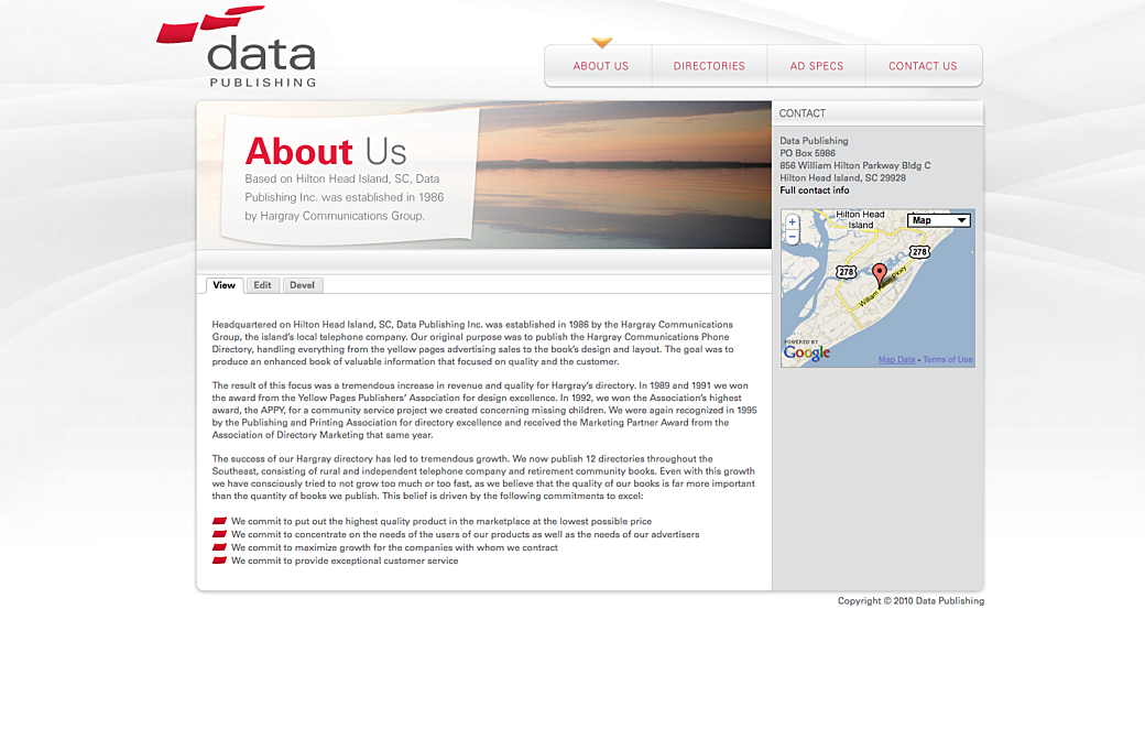
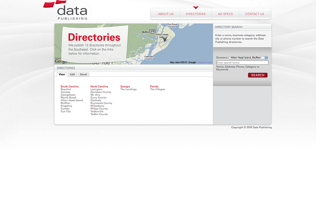
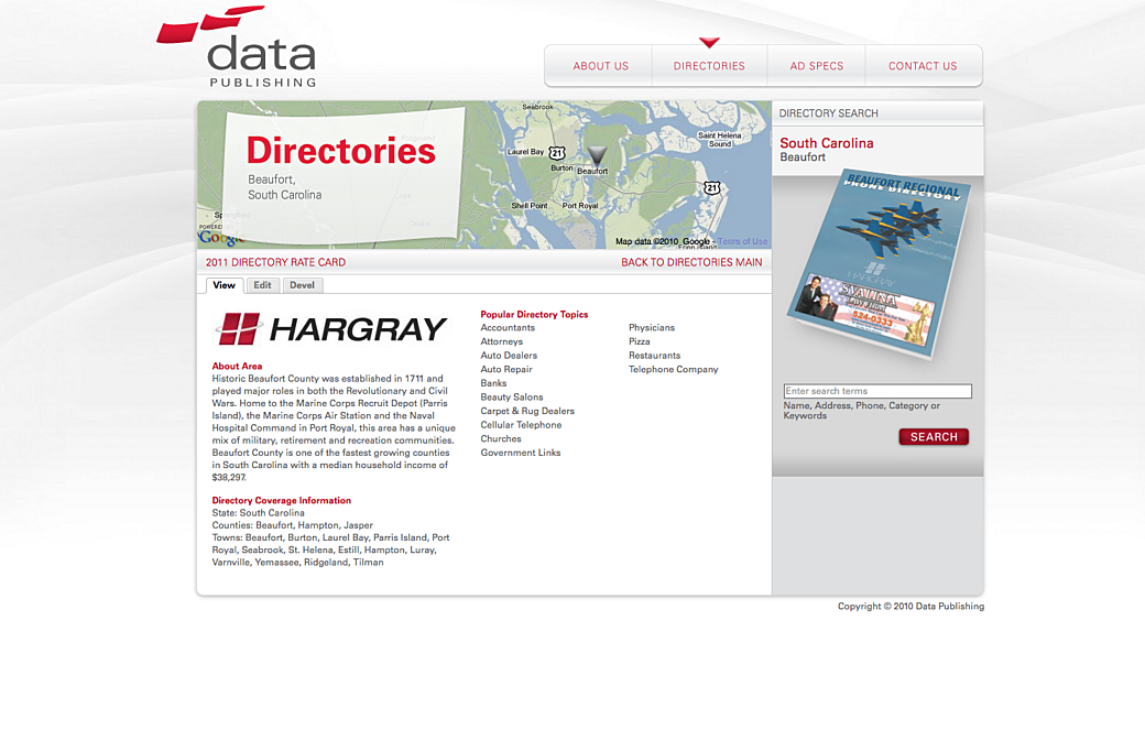
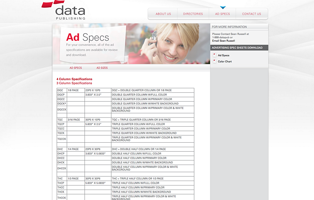
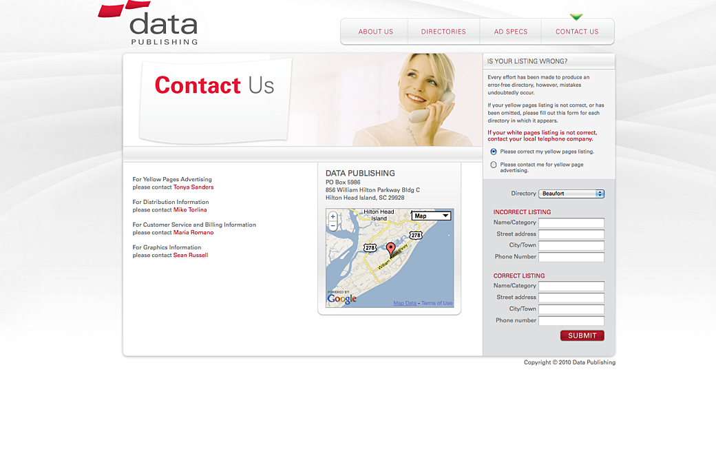
The Data Publishing website was created with Drupal on the back-end and the front-end was made with HTML and CSS. When we launched the website it was not optimized for mobile, but because of the audience being more business focused at the time, it wasn’t a concern or something we recommended investing in at the time.
Hargray Search and HTC Search
From 2011 to 2012 we launched two more websites for Data Publishing: Hargray Search and HTC Search for customers in their respective markets. Both websites were separate entities, but they started from similar code bases.
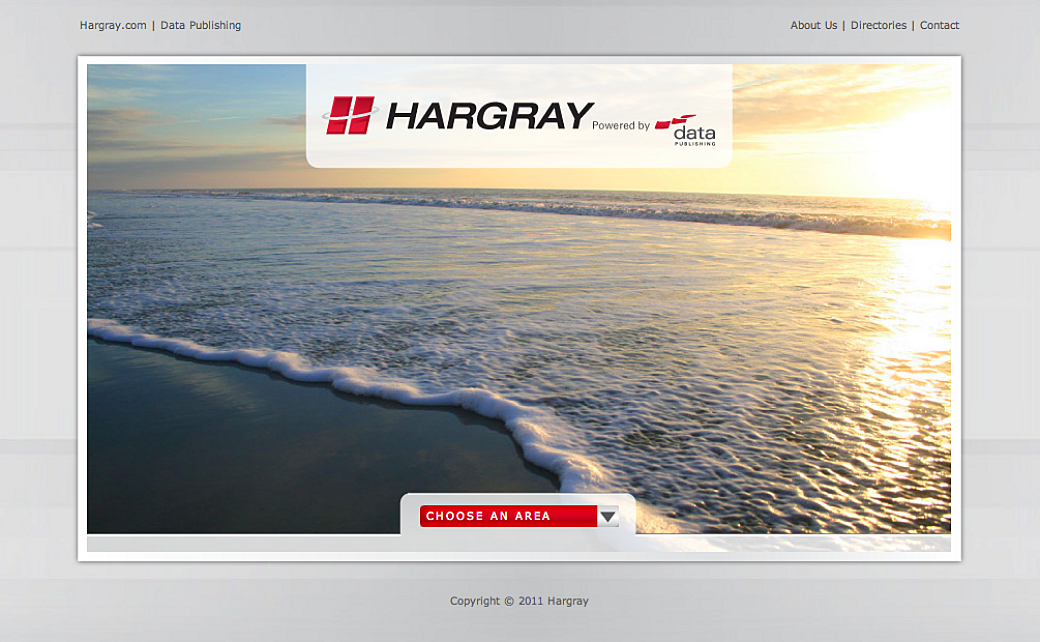
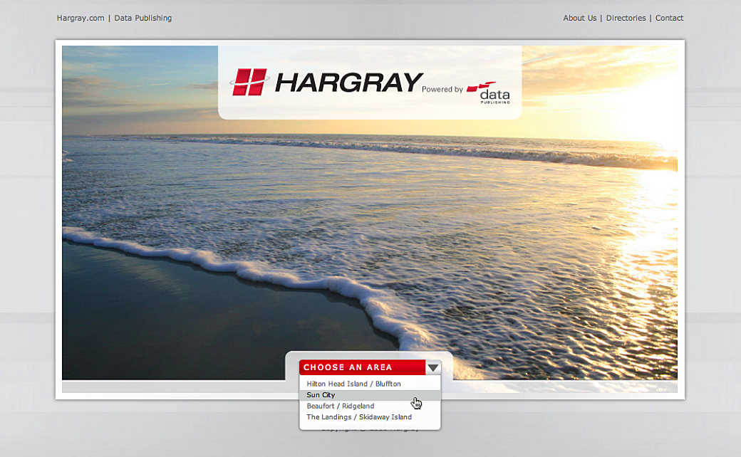
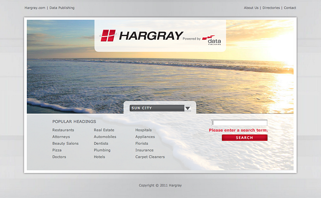
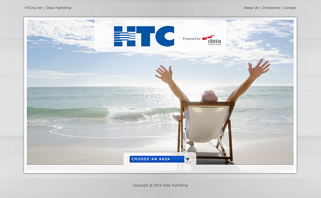
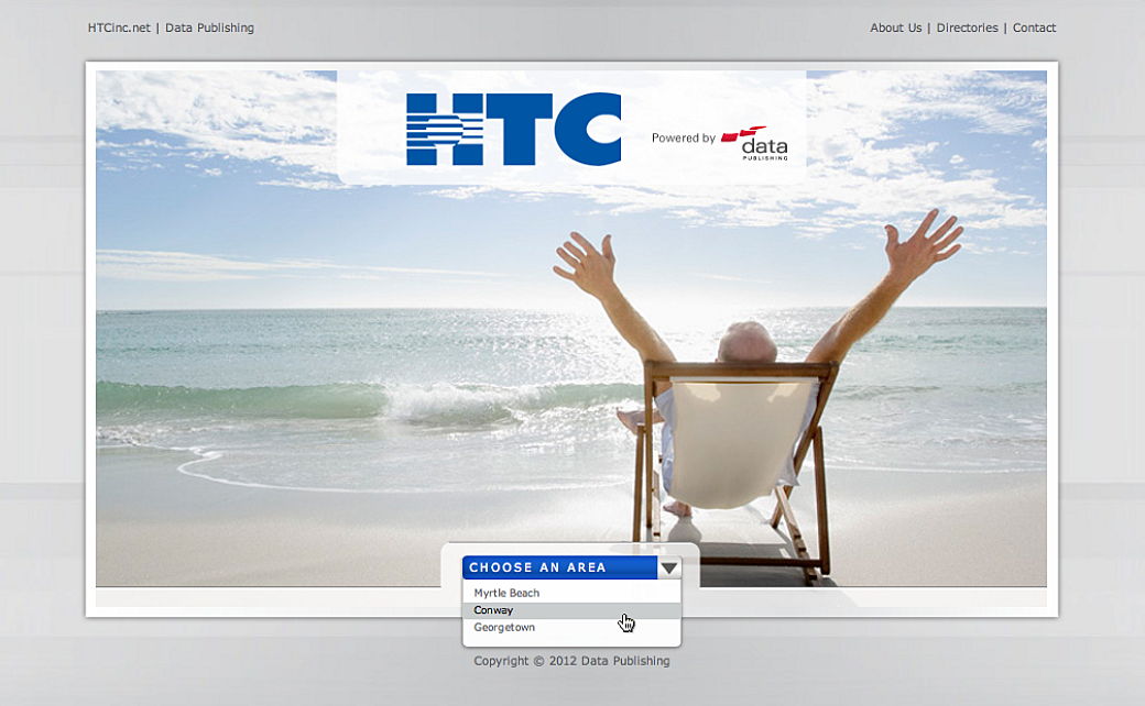

These sites had a broader audience than the corporate website so creating a mobile site was something we wanted to add onto the project. We decided to create m-dot mobile sites for each website.
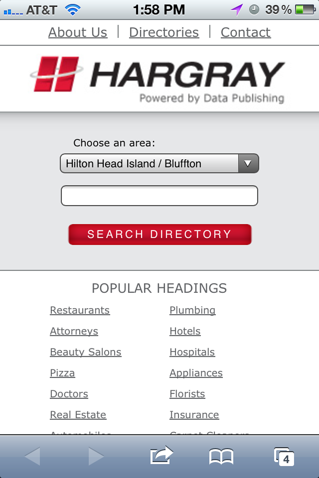
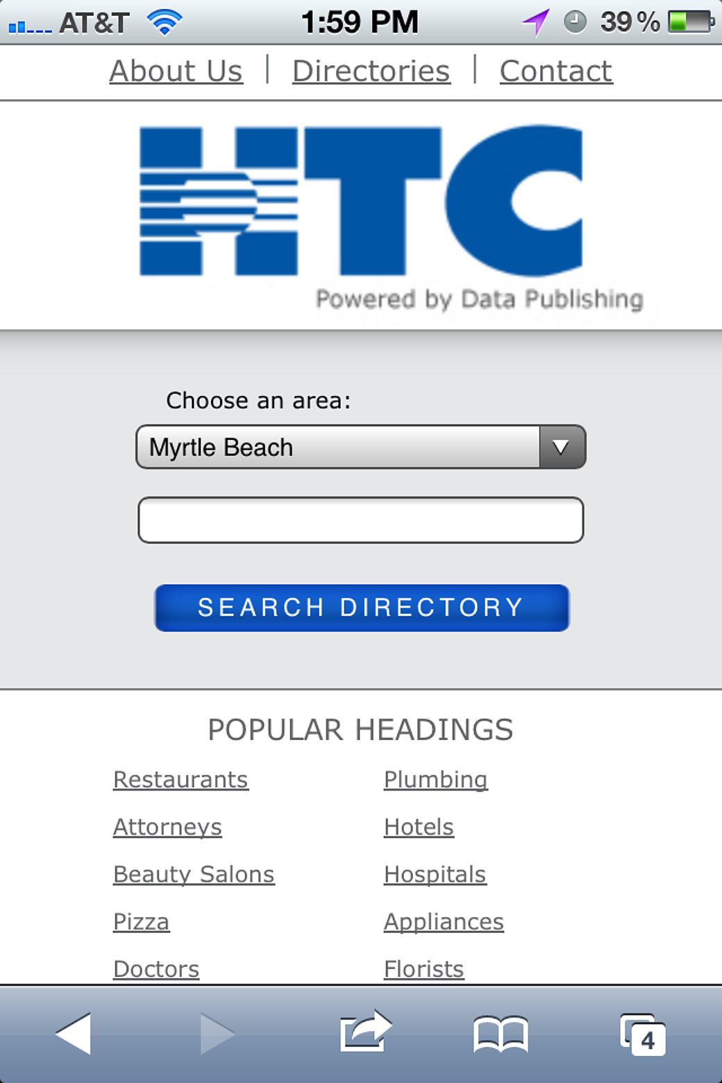
I was involved in all three of these websites. I believe the Data Publishing site was built on top of Drupal, but the search websites, and their m-dot variants, were made with HTML, CSS, and maybe a little jQuery.
Interlude
In July 2011, the A Book Apart book, Responsive Web Design, was released on paperback and epub. I had read the A List Apart article around RWD and as soon as the book came out I devoured it. Around this time the leadership in our web development team changed and I was finally given the role of guiding the technologies we used in our websites. With that, I declared that the Data Publishing sites would be the last m-dot sites we created, and the rest of the developers agreed.
Abbott’s Frozen Custard
We designed the Abbott’s website as a desktop and m-dot combo, but—as per above—we changed course and time boxed a responsive web design PoC. It worked out well and the client agreed with the approach.
The website was a website for a frozen custard franchise that was well known in the Rochester, NY area. We included a store finder, links to an online ordering tool, a blog, and information for people who wanted to start their own store in the franchise.
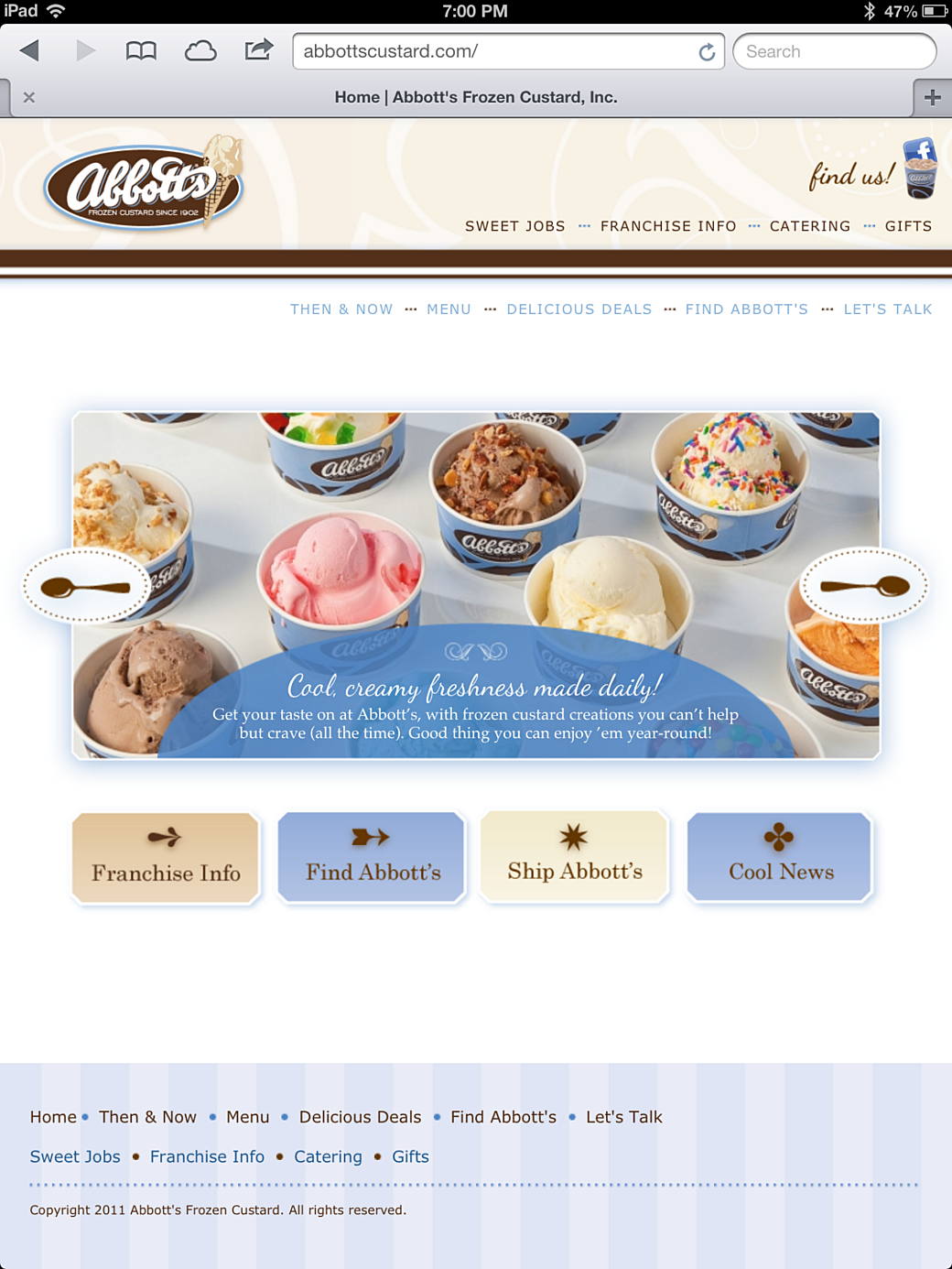
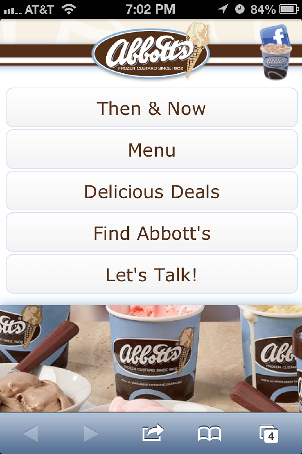
The site was made with HTML, CSS, and jQuery on top of a Drupal-based CMS. jQuery was used for the homepage carousel and heavily relied on for the mobile menu. We even used a color picker field to make a display of all of the flavors served at Abbott’s stores.
Fin
It’s hard to recall the time when we weren’t using responsive web design practices in our websites, because it’s become so standard these days. I remember our designers each had to wrap their heads around the concept of designing for multiple screens. We’d have debates about where to put breakpoints and if you should go mobile or desktop first. It felt like a really exciting time to be a part of web development.