
Every web developer at Dixon Schwabl contributed to the main DS website from time to time. Sometimes adding features or fixing bugs. There were already 2 versions of the DS website by the time I started there in 2007, but for 3 redesigns to come I got to be the primary developer and architect—making technology choices and working closely with our design team to bring their visions to life.
The DS website served as a new business tool, a press room, a directory of our employees, and a blog to show off our culture and expertise. Over the years, the scope of the website changed, but the thing that remained was that each version of the site was a web development playground full of fun effects and designs that pushed our web development skills.
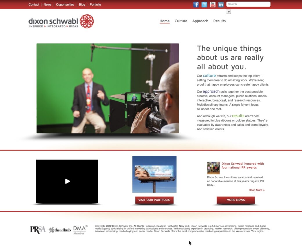
2006 Era
The website as it was when I started had a Flash header with animated swirls and a bouncy effect that happened whenever you rolled over an item in the site’s main navigation. The homepage featured a video message from the company founders and every few months we would rotate out the video based on what was going on around that time.
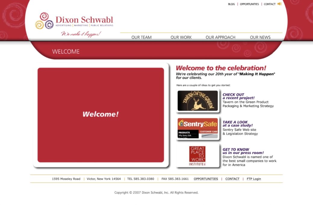
I wasn’t the original developer of the site, but I wound up taking it over and making a lot of updates to it over the following years. The site was based on PHP to help with simple includes and Flash, HTML and CSS were used mostly on the interior pages.
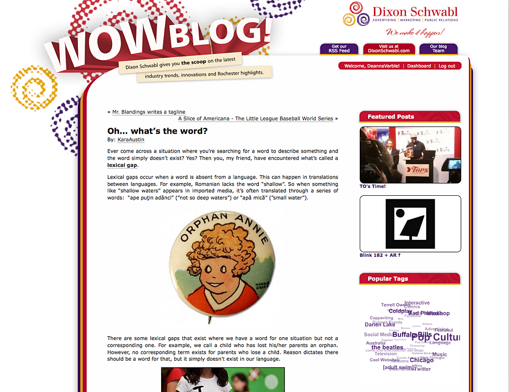
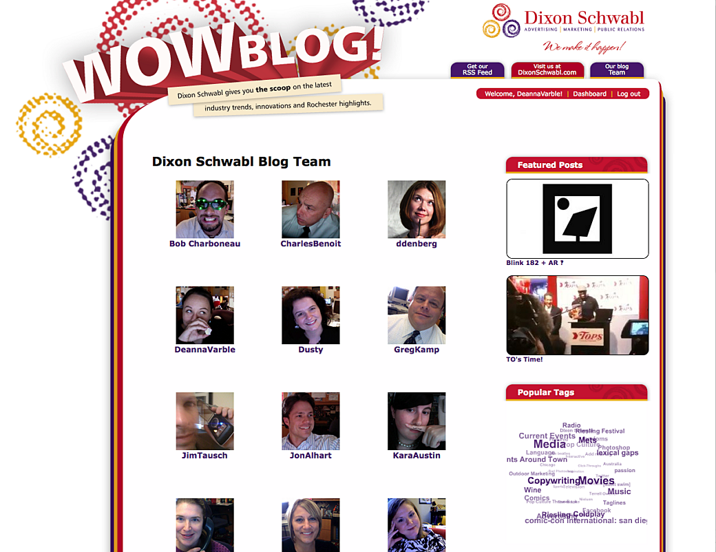
We eventually added a blog and in order to do that we created a separate website so we could throw just the blog onto a CMS platform. I don’t recall if it was based on WordPress or Drupal, but it would have been one of those at the time.
Early 2010 Era
DS was ready for a rebrand and with it we redesigned the website. As was common around the time, we dropped Flash and used CSS and jQuery plugins to pull off some of the fun interactions in the site.
For this version of the site we had this rotating cube and lots of drop shadow effects around the site. The site was built on top of Drupal to make it easier to update content, such as the news and blog posts. Our developers still made a lot of updates around the site.
I think this site was programmed by a few of us, but I remember working on the CSS-based 3D cube on the homepage. While there weren’t defined back-end and front-end roles on our web development team, at this time it was common that I would trend front-end where a couple of other developers handled more of the CMS work.
2014 Era
Around the time of this redesign our Creative Team leadership changed and it kickstarted a whole new era of creative thinking. The bar was being set high and we worked together to meet it.
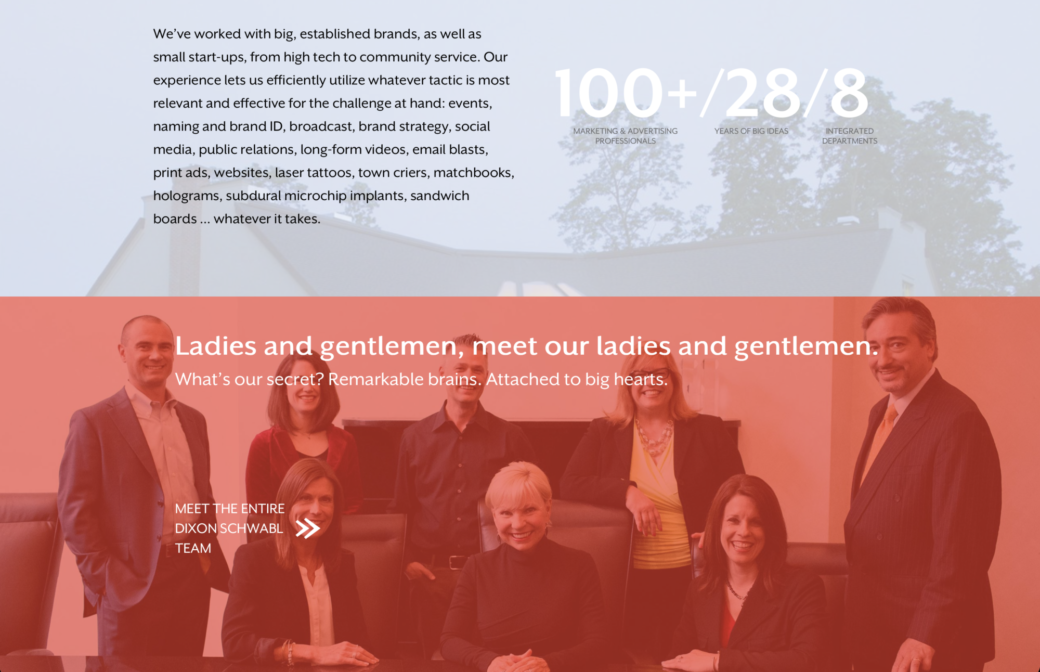
The design of the 2014 site was very ambitious. It would be responsive, include videos and transparent overlays with large, bold color changes. It had a section on the homepage that when clicked, the entire homepage would shift over to the left and a directory of each employee with custom photography slid in.

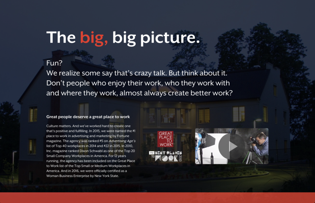
I was the primary developer on this site and I worked closely with our designers on this one. Around this time we decided to get away from using Drupal as our primary CMS platform and after trying out a few more options we decided to use Statamic on this site. We did this because we wanted the static front-end for performance and the thought at the time was that most changes to our website would get done by the web developers, so we only content managed frequently updated sections, like the News and Blog.
Migration to Craft CMS
Well, by 2015 we hit the limit of what Statamic could do at the time, and after spending more time on a search for a good CMS option, we decided to re-platform the front-end onto a new Craft CMS back-end. This turned out to be a very easy port because both CMSs were very hands off on the front-end side of things. We just needed to re-create the CMS schema and import content into the database.
Since we were setting up a new CMS, we opened up content editing so our writers and designers could start to jump in and make changes to things like our portfolio. There were still a lot of areas where we made changes in the code, but the CMS also freed up our web development team during big new business pitches.
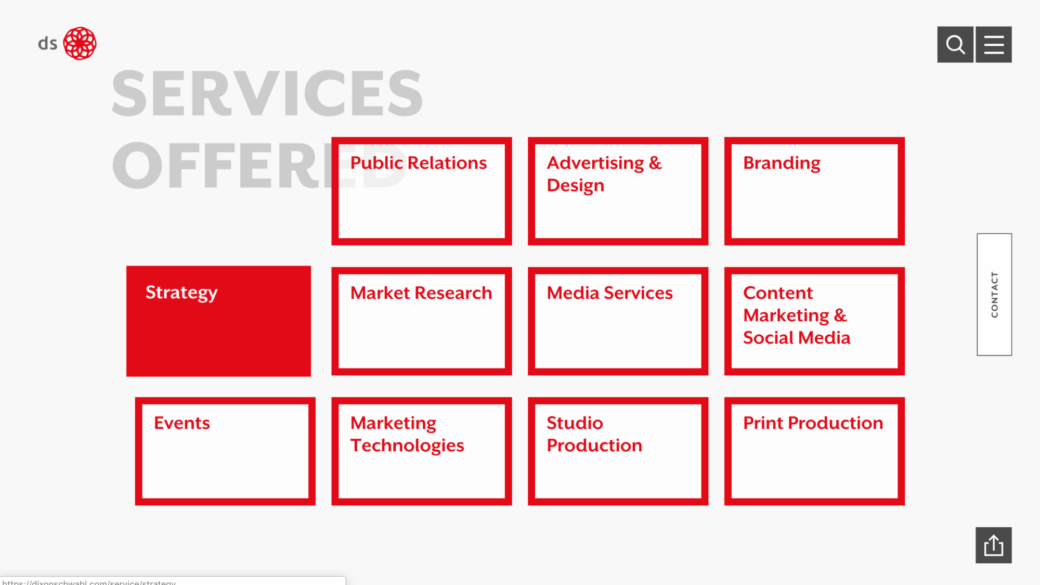
2018 Era
A few years later we were ready for another website refresh. We had learned a lot about accessibility and our brand was continuing to evolve and we wanted the website to reflect that.
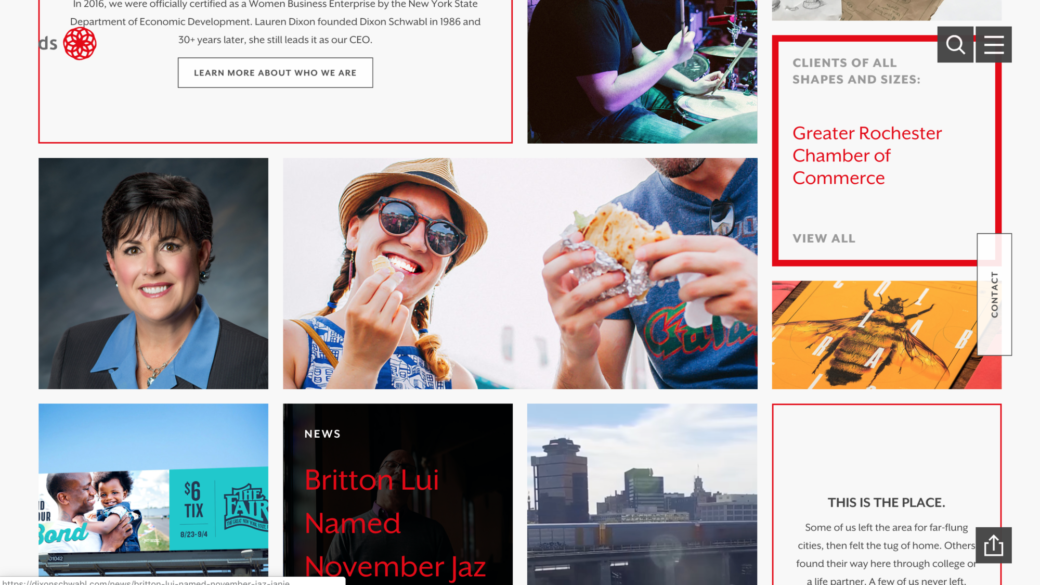
We kept the same Craft CMS back-end, but we remodeled things like the portfolio and case studies sections so that at this point any art director or writer could jump in and make changes to the various pages. At this time we did a lot more with page builders and we made sure that you can mix and match sections like a video above a block of text and then above a small set of images in a grid.

I was the primary developer for this site, as well. While the visual side of this site seemed a little simpler than the previous site, this one had a lot more complexity in how parts were built. As we were doing a lot more with Vue.js, we wound up making a lot of the interactive and animated parts components.
CSS grid was also relatively new at this time and we got creative with how content overlapped and lived on various grids throughout the design. On the homepage we had created a grid that we would use to show links to portfolio pieces, news stories, case studies, and featured employees. The grid was fully content managed and I wrote a Craft CMS plugin, called Grid, that I used to manage content in the grid.
We also did a lot of scroll-activated animations, so the items in the homepage grid would all animate into place as you scrolled down to them. I found an early prototype of this animation that I had done.
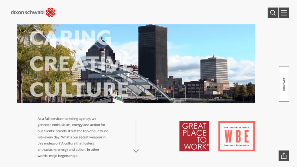
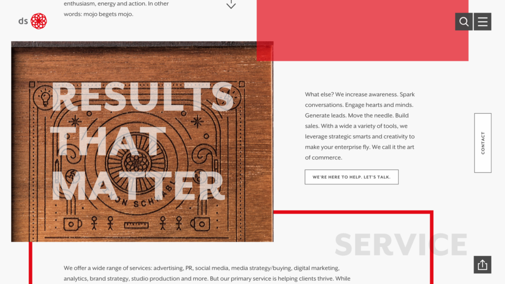
2021 Era
As a cap to my 14-year time at Dixon Schwabl one of the last projects I worked on was the most recent redesign of the website. Unfortunately, I didn’t take the time to grab screenshots of the website around its launch, but I have a behind-the-scenes video showing a dark mode switch and a little bit about what the homepage looked like as we got close to wrapping up development:
As Jamstack picked up steam in some areas of web development, we used this redesign as an opportunity to get on board and learn our way through things like incremental front-end builds and setting up Craft CMS’s Live Preview with a headless front-end. The back-end continued on the same Craft CMS setup from 2015, but the front-end was created using Nuxt in static mode.
Fin
I have so many more stories about these sites over the years and I remember pulling more than one all-nighter to have some of these redesigns ready to present in our all hands agency meetings.
The DS website was always a place where I learned something new around web development. Our leadership were enthusiastically open to trying new ideas and using our site to wow our clients. When I think about these projects I appreciate how much we got to explore and learn, while getting support from some amazing designers and creative thinkers.